Vellum Venom Vignette: A Bronco cannot change its stripes
Perhaps my headline is a bit misleading: The Bronco is neither a zebra nor a tiger. It is a cow, a cash cow of the highest order. Ford’s decision to tweak the T6 truck platform to give Jeep’s Wrangler a legit competitor was brilliant and long overdue. Dearborn hit another home run by extending the Bronco brand into the C2 platform via the Bronco Sport soft-roader presented here. Sure, it’s not “the real” Bronco, but it is precisely what the market demands: mall crawling and high(er) speed family hauling.
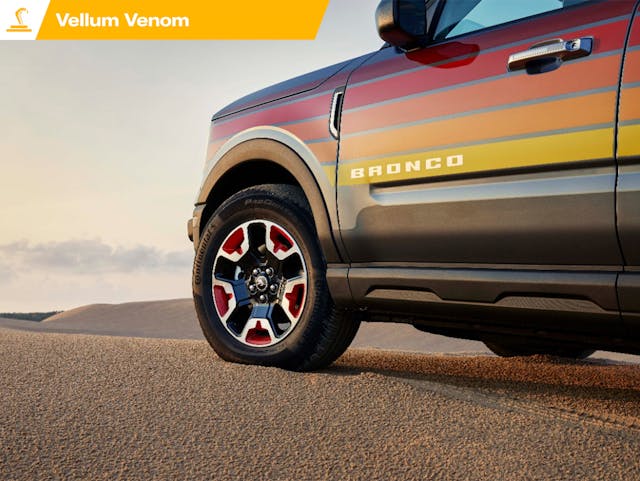
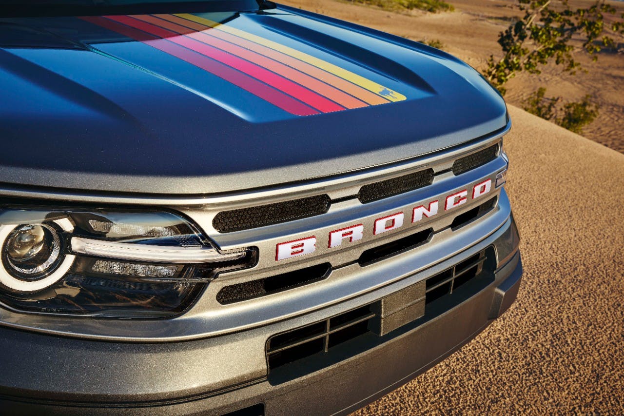
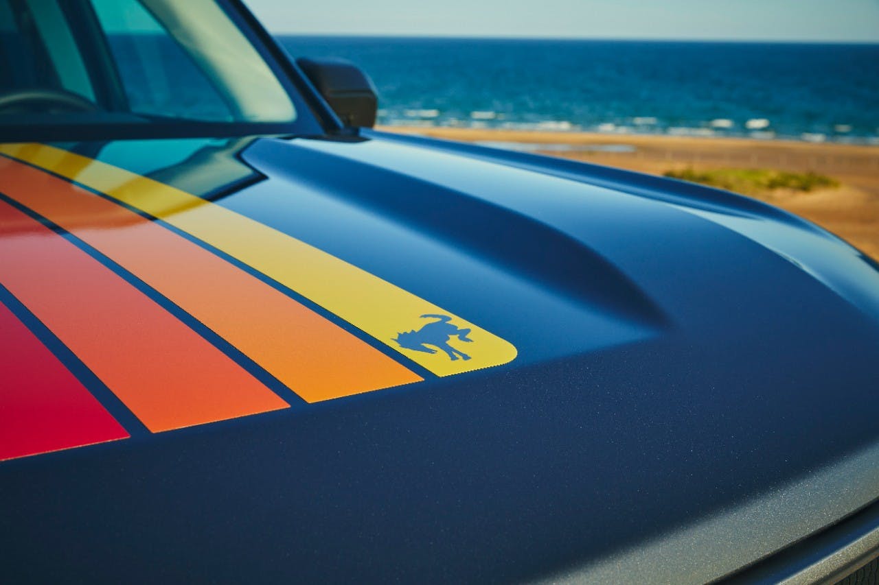
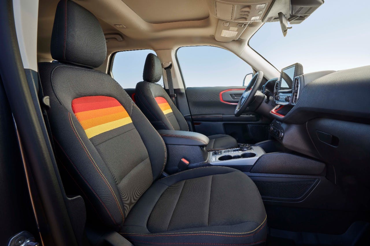
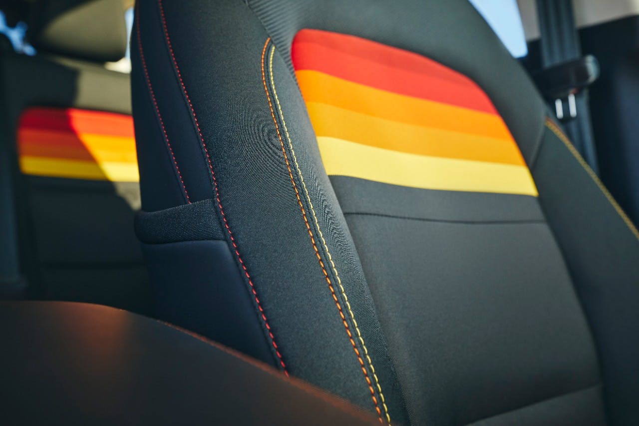
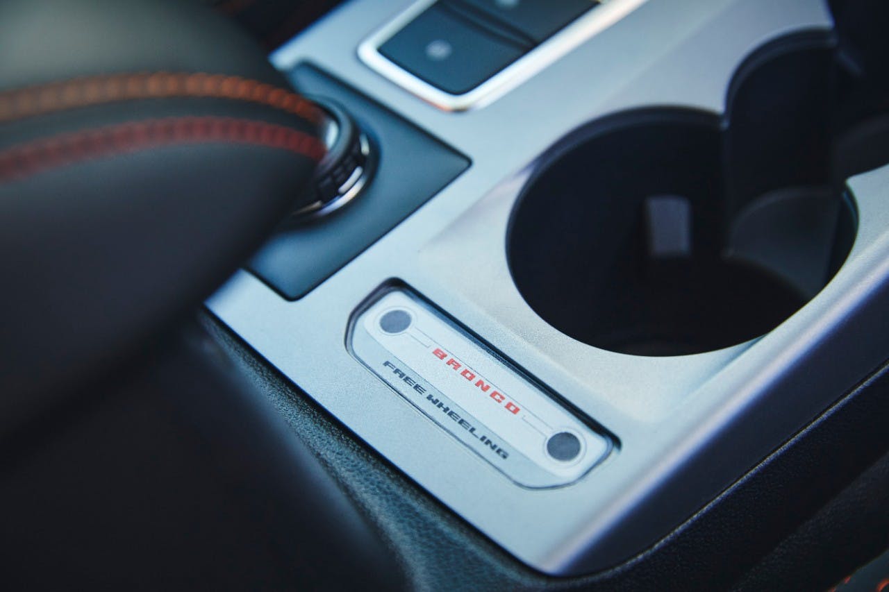
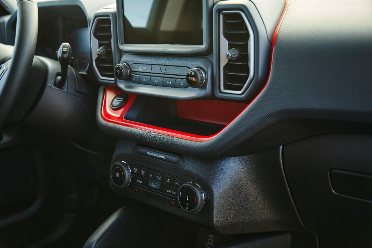
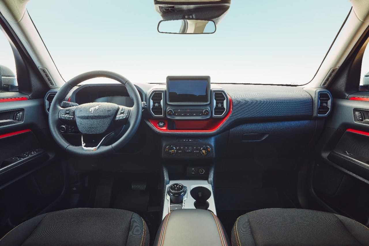
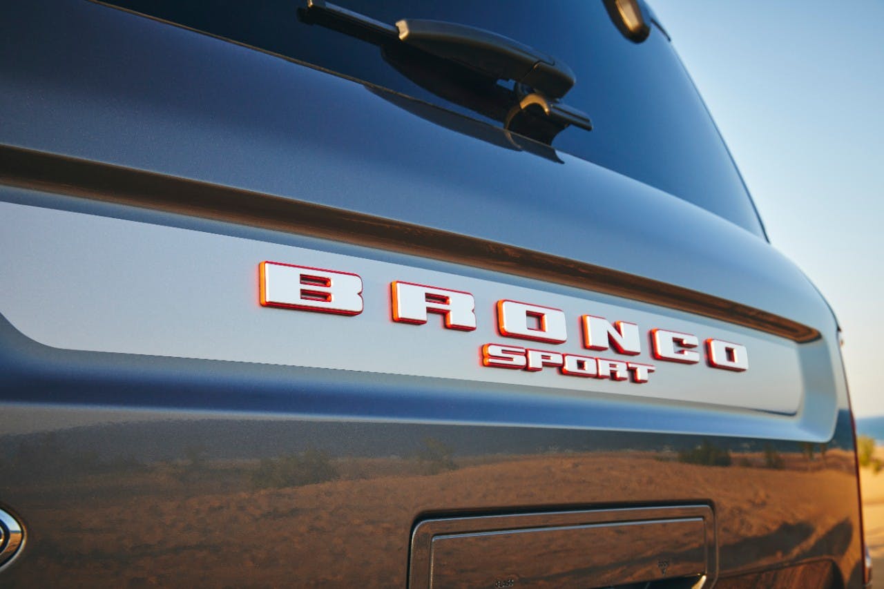
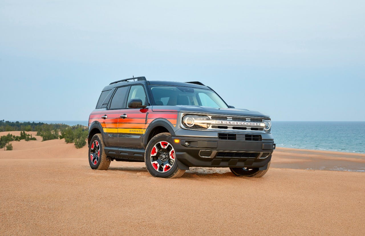
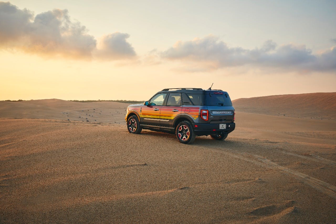
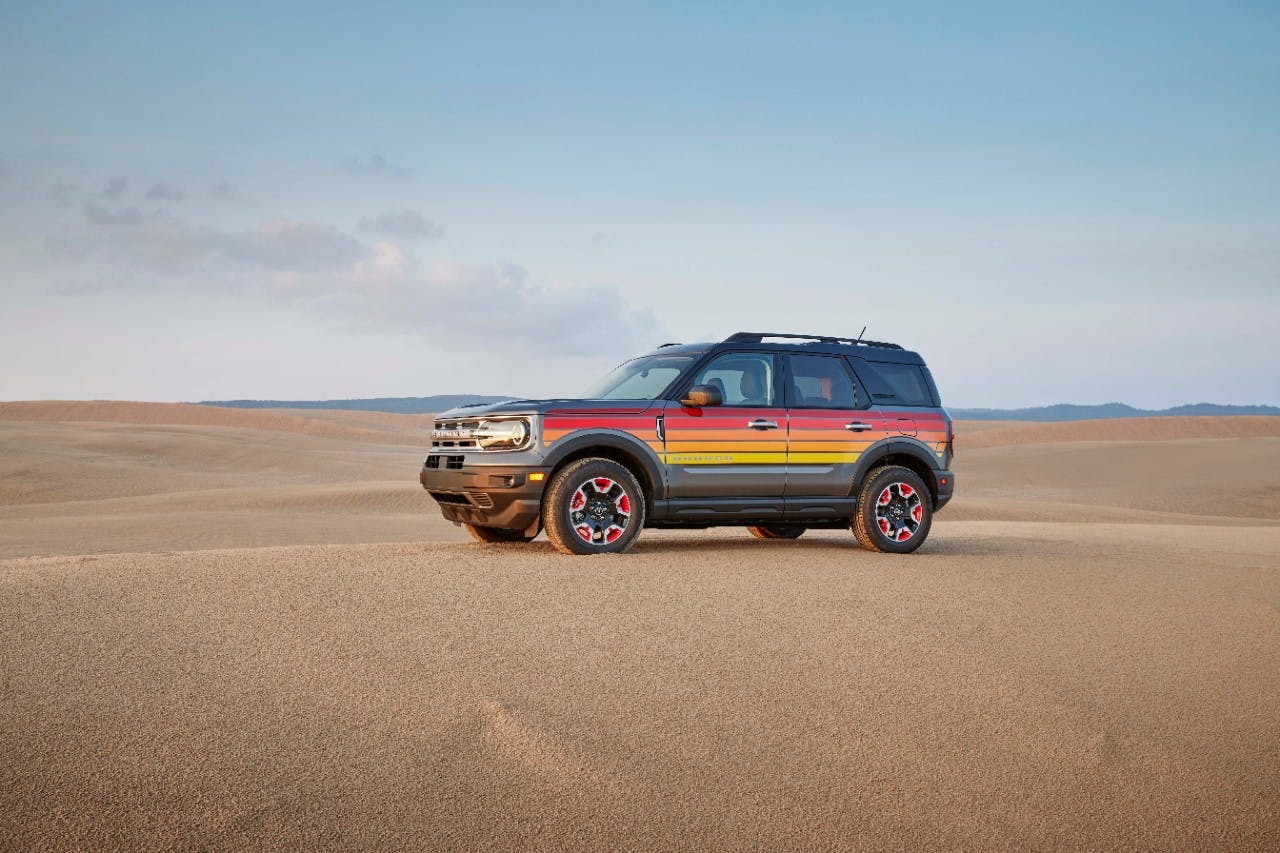
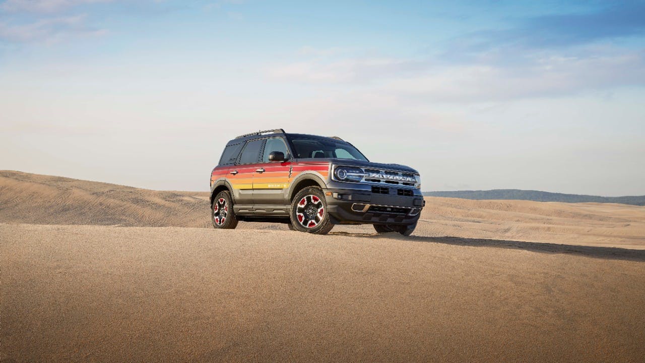
The Bronco Sport’s styling and off-road upgrades are still true(ish) to the Bronco name, but then Ford threw us another bone: a set of throwback decals and interior trim taking us back to a simpler time. Then the company gave the vehicle the name it so truly deserves: Free Wheeling.
The Bronco Sport Free Wheeling proves Ford is focused. The company is no longer fearing its great escape from passenger-car mediocrity; as it is clear that Dearborn’s crew has no interest in fighting Toyota and Honda for sedanlette scraps. Why bother, when it is far more profitable to be a maverick and take a path that others can’t possibly travel?

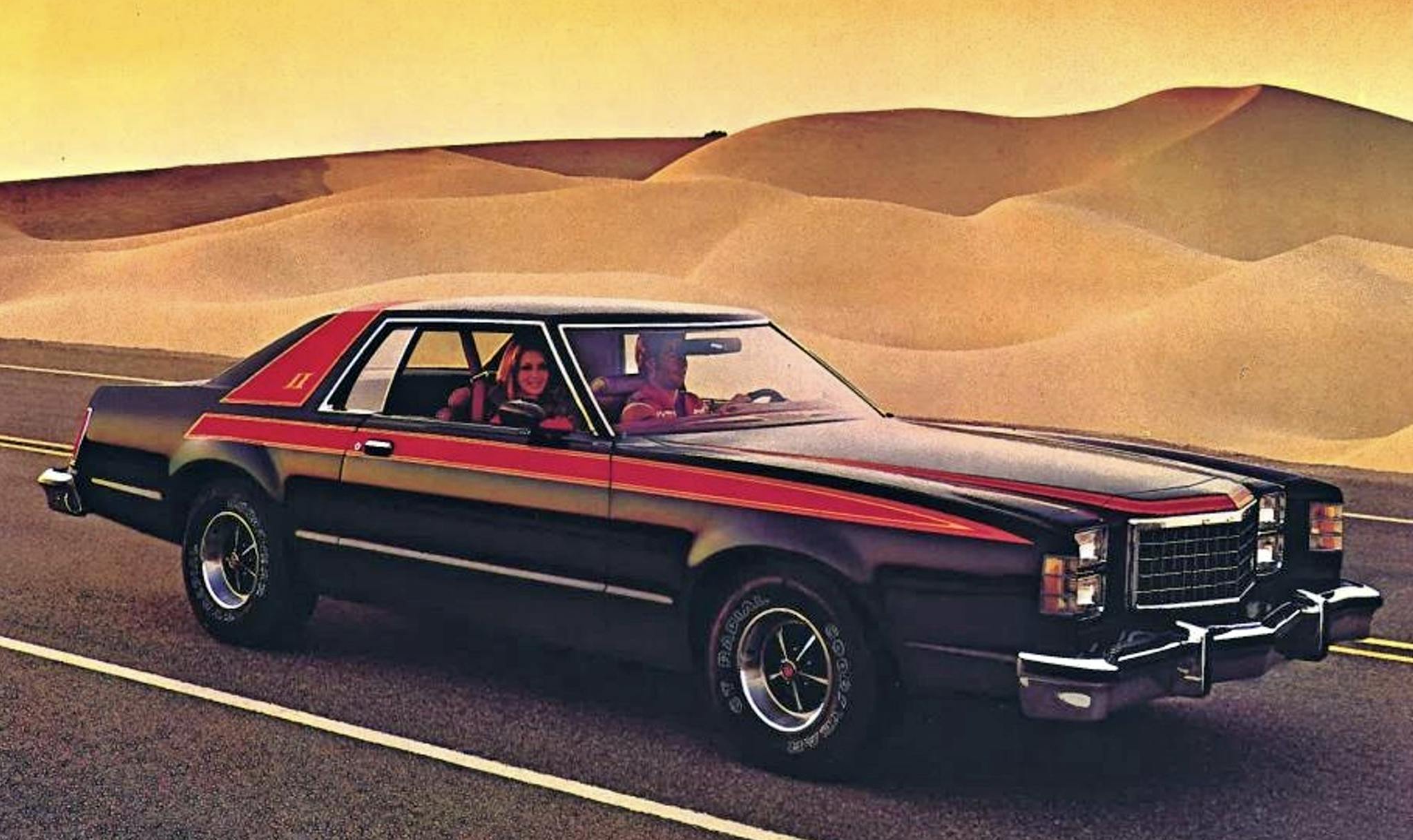
C2 platform jokes aside, Ford is indeed capitalizing on the trim levels that made the company so special. (It’s about time, considering how leveraged the Dodge brand is to trims like Demon, Scat Pack, etc.) The 1970s Free Wheeling package is both obscure and tragically neglected, just like other limited production whoppers from the era like Swinger (Dodge Dart), Palm Beach (Buick LeSabre), and Talisman (Cadillac Fleetwood). In 2023’s sea of globalized mediocrity, new interpretations of these retro names and their bolder trimmings are welcome dashes of uniqueness.
Naming conventions aside, let’s get back to the Bronco Sport’s color gradient stripes. These beauties are actually a staple of 1970s graphic design, a multi-disciplinary trade applicable to any industry. Even the U.S. government made a big deal about graphic design; you can see excellent examples of the era on this Instagram account. Graphic designers working for government entities and corporations usually reduce complex themes and mission statements into a simple image, one that is easily to process and remember. Your favorite might be the NASA “worm” logo, which also made its triumphant return just a few years back.
Color gradients were a smaller part of this ’70s trend, commercializing a design theme normally reserved for hoity-toity modern art circles. I’d like to think this mass adoption tickled one Mr. Josef Albers a delightful shade of pink. Or perhaps the noted color theorist felt the joy in shades of red mixed with increasing amounts of white?

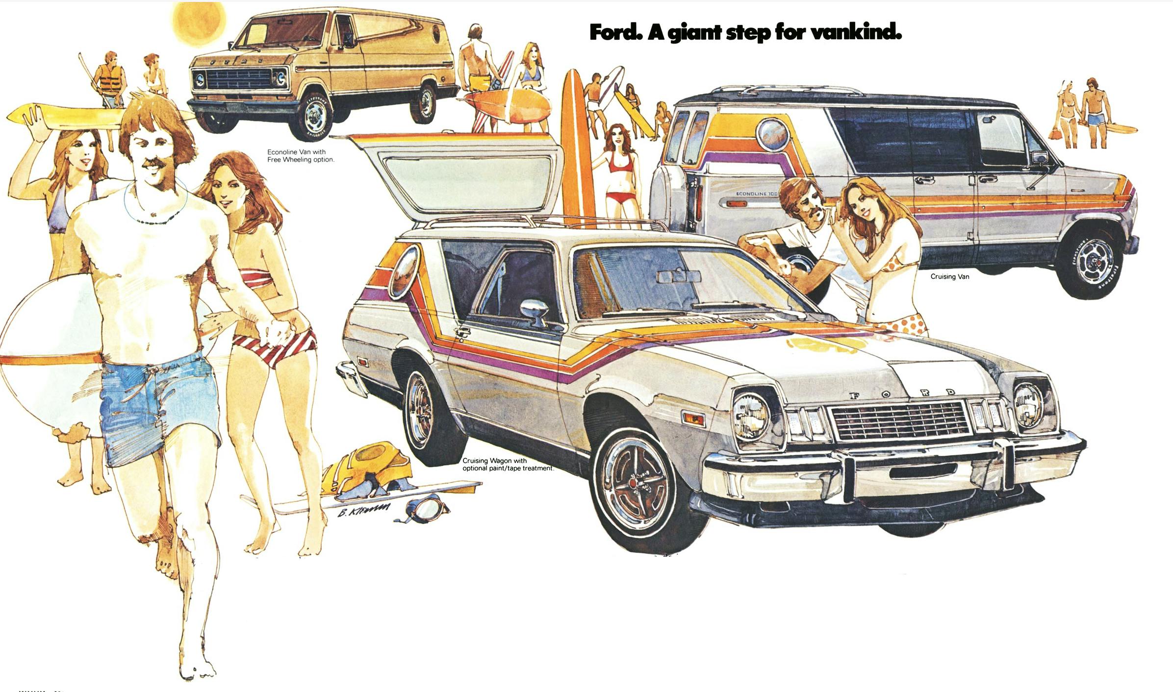
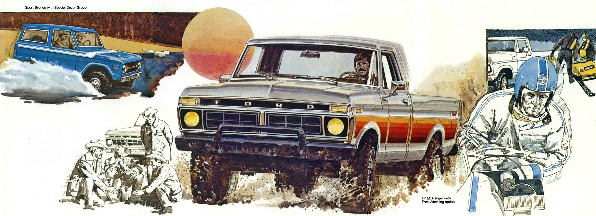
No matter, the Free Wheeling color gradient stripes on Ford trucks/vans/Pinto wagons offered the requisite amount of fun for buyers in the 1970s who were looking for a brighter, more cheerful vehicle to present themselves to the world. Perhaps the color gradient trim played well with many Americans’ notion of embracing their own need for freedom in the 1970s—or perhaps that theory goes a bridge too far, even in automotive design and branding.
However you skin it, spicing up cars with graphics was a big deal in the 1970s. Every Detroit automaker needed to sell more sizzle and less steak. Screaming chickens on Firebirds are the best example of the breed, but the designers knew that making 5-mph bumpers, pillared hardtops, and plastic-y interiors sexy wasn’t gonna be easy on any car. But they made it work: Check out the seventh-generation Thunderbird’s sales if you don’t believe me.
But it is not a stretch to suggest that today’s younger car buyers feel the same state of malaise as referenced by Jimmy Carter, so perhaps a bright collection of decals and interior fabrics are absolutely needed for the 2024 model year.
If so, history repeats itself. Those who are attuned to the cyclical nature of human existence can capitalize on that knowledge, and the good people behind the branding of the Ford Bronco are hopefully enjoying the multi-colored fruits of their labor. That said, pushing a retro agenda in a design studio can only go so far, as Josef Albers was likely right when he said: “Traditionally art is to create and not to revive. To revive: leave that to the historians, who are looking backward.”
***
Check out the Hagerty Media homepage so you don’t miss a single story, or better yet, bookmark it. To get our best stories delivered right to your inbox, subscribe to our newsletters.


It was a HUGE mistake to name two totally different vehicles with the exact same name .
Just stupid beyond belief .
It cheapens the name to make a smaller cheaper much less capable vehicle with the exact same name .
Stupid beyond belief .
Chevy did it with the blazer , back when the blazer was a well known name . Every person on the planet has heard of the Chevy blazer .
So GM started making a toy rally different vehicle and also named it the blazer , the S-10 blazer .
And ford did it with the electric mustang also .
Almost as bad with similar sounding names , a Festiva and a Focus .
A Volt and a Bolt .
Really ?
That’s the best you could come up with ?
Two different car names that sound exactly the same on a phone call checking on parts ?
It no more “exact same” than the Bronco II was to the Bronco. The truth is, it was genius to name the Bronco Sport. Because those who don’t like it may gripe about it, but that won’t stop them from buying a Bronco if they are Bronco customers. On the other hand, it brings the Bronco name to an entire audience of people that want a taste of the perceived Bronco lifestyle without the rugged off-road capability. The Bronco Sport isn’t some watering-down of the Bronco name, it’s a brawnier competitor to a Subaru or similar SUV that sees lighter off-road duty (if it goes off-road at all). 95% or more of SUV owners never meet a rougher road than at the pumpkin patch or Christmas tree lot or path to the groomed campsite. Bronco + Bronco Sport = far more sales than Bronco alone.
The orange gradient stripes are one of my favourite things, period. Glad they are back in a modern form so it is easier to explain it to non-car people. The insert on the seat is great too.
Hopefully you can get it on a black F150…
Ford is basically turning their model lines into grill variants with styling cues: F150, Mustang, Bronco [conservative truck, sporty, rugged] they just haven’t fully committed to the concept and they probably think they need at least one last identity for the “other” generic-safe spec most of the lineup is.
Extend that idea and it is pretty easy to keep the Explorer, Expedition, etc. in the F150 style, I fully expect more sizes of Mach E variants, a top-of-the-size and EV Bronco is likely coming…
That last identity being more cohesive, even if conservative bland, could be better (Thunderbird, Taurus…?)
Reminds me of the $150 71 Pinto I had in 77. The rich kids had the new ones with the stripes. Mine had not a moonroof but a floor roof. Lots of floor rust! Had a girlfriend at the time with a two year old Pinto that also had some sort of stripe package. I went to open the passenger side door and it fell off onto the street! The hinge connections had already rusted out. Vega’s were worse. That being said we had a LOT of fun in the 70’s!!!!!
Not a stripes guy myself. Interesting to see 70’s striping coming back for now modern dull appliances / cars. Somehow given the political and economic climate it seems appropriate.
I dig it. I miss stripes and decals on cars. They gave character when it was in short supply. As a retro design theme, I think it works well.
Wow, it seems like the retro design format is running the gamut on all aspects of vehicles. What’s next, mod tops & interiors? Can someone not come up with a fresh train of thought other than let’s see how much we can milk the cow?
The ’70s were about awful vehicle designs and even worse color schemes. This is hideous to me. It’ll be interesting to see how many takers there are for this package.
Bad idea then. Worse idea now.