14 stunning pieces of livery art we can’t look away from
Just as important as the shape of a race car is its livery. Graphics, colors, and typography complete the car’s personality, distinguish it from competitors, and provide instantaneous visual identity. Over many years, sponsoring brands gain worldwide recognition and become unmistakable icons for motorsport fans while also being readily recognized in the wider cultural realm.
Portuguese illustrator Ricardo Santos infuses his passion for racing into his art to create his own interpretations of his favorite racing liveries, and he explains why they have endured.
BMW M1 with BASF
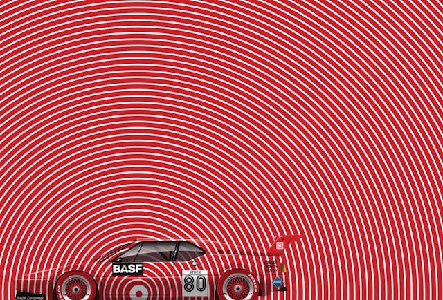
The BMW M1 with BASF colors is a good example of a livery completing a car’s personality. The wedge-shaped M1 served as a perfect canvas for the spiral that was part of the BASF cassette logo.
In my artwork, I always like to bring out the decoration beyond the limits of the car’s form. The idea is to reinforce those shapes and to make the decoration a graphic representation of the movement and the vertigo of speed that motorsports represents. There’s nothing better than opening the BASF logo beyond the limits to hypnotize and involve us in this vertigo. This is the Procar Series BMW M1 driven by Hans-Joachim Stuck in 1980.
Tyrrell Formula 1
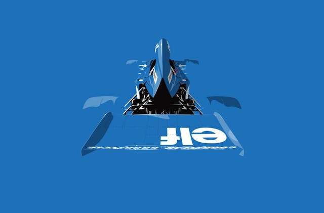
The blue used by the Tyrrell Formula 1 team is unmistakable. The idea in the illustration of Jackie Stewart’s 005 was to reinforce this blue by using it almost as a single color throughout the illustration.
One of the graphic points that fascinates me the most is the pure contrast between the blue and white of the Elf and Goodyear logos. It’s so direct and effective in the message and the opposite of what is done today, in which there is an exaggeration of colors and colorful stripes and shapes that often make it difficult to read and identify the sponsoring brands and even the cars.
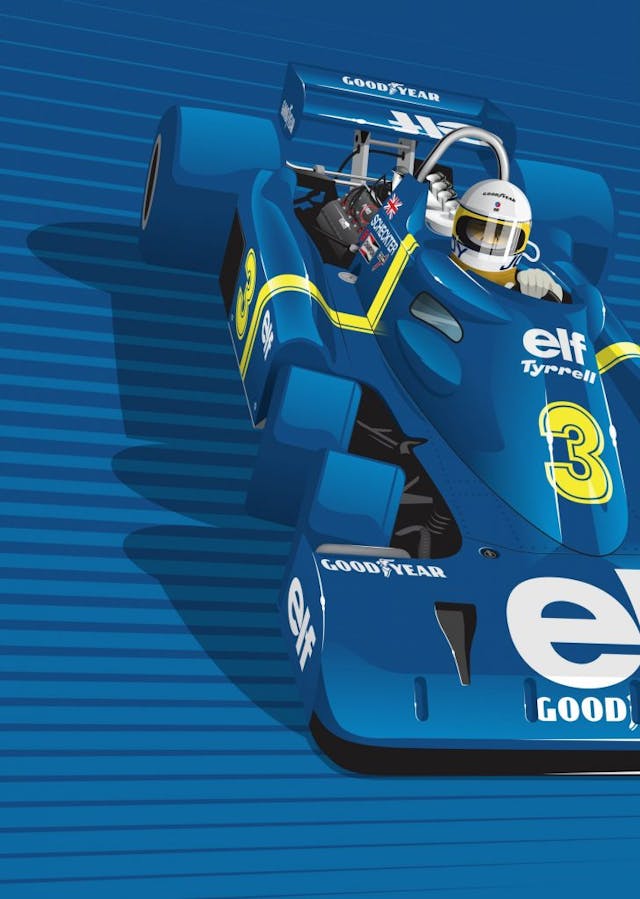
The work above was made for a Racer magazine cover, and the concept was the same I used for the Tyrrell 005 illustration. For Jody Scheckter’s P34 six-wheeler, I just added more detail and some graphical contrast, with those background stripes, to reinforce the presence of the car.
John Player Special
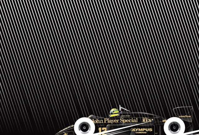
The simple black and gold of the John Player Special livery on the Lotus 97T is punctuated by Ayrton Senna’s iconic fluorescent yellow helmet (a color used only in 1985 and 1986, suggested by Sid Mosca, who painted the Brazilian driver’s helmet to maximize its contrast with the car).
This set of colors and pinstripe shapes is instantly recognizable even today. I tried to explore them in the simplest way possible, by just adding white stripes that represent the rain that fell at the Estoril Circuit in 1985 during Senna’s memorable first victory in Formula 1.
Sunoco/Porsche+Audi
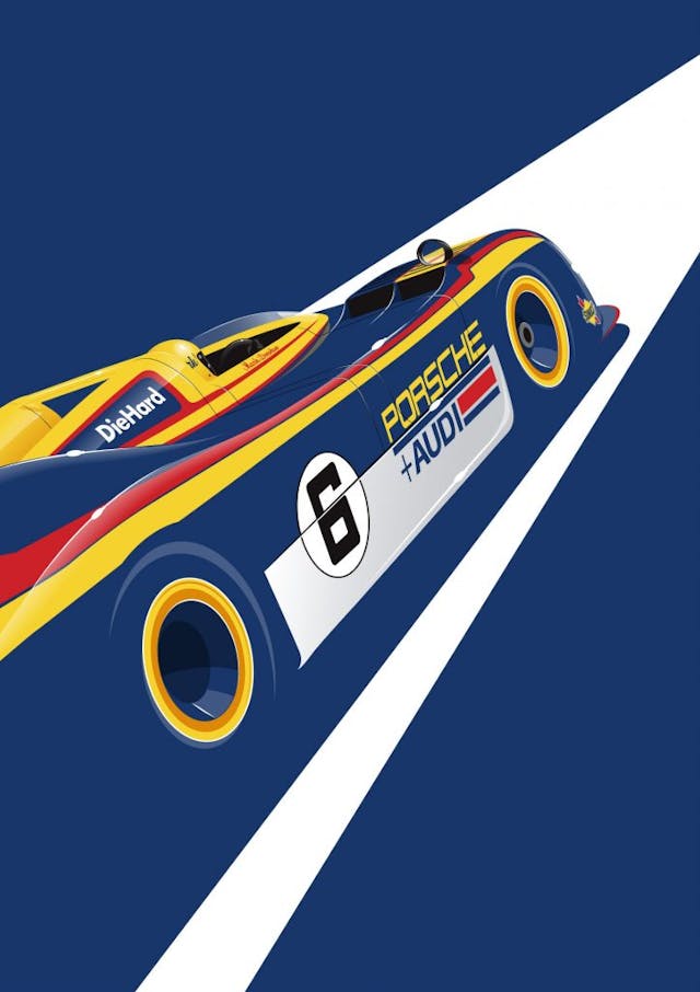
The Sunoco/Porsche+Audi livery designed for Team Penske by artist Terry Smith is a good example of what makes an iconic race car. For this illustration for Racer magazine, it was enough to show a little bit of the Porsche 917/30 for it to be immediately recognizable. That’s what I tried to represent in this work, in the simplest way possible, using the car’s background color and highlighting the yellow and the logos.
Lotus 49
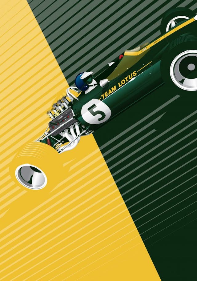
Before the advent of sponsorship, race cars were painted in colors associated with the country of origin. Lotus used the well-known British Racing Green for the first few years, to which a yellow stripe was added years later.
The Lotus 49 was the first car to use the most famous and successful engine ever in Formula 1, the Ford Cosworth DFV. In this illustration made for a Racer magazine cover, I tried to highlight and make a contrast between the British team’s 49 chassis and the Ford engine, using the car’s original colors. The graphic contrast reinforces the successful association of two technical innovations that revolutionized Formula 1 and provided the Lotus team with many victories.
Alitalia Lancia Stratos
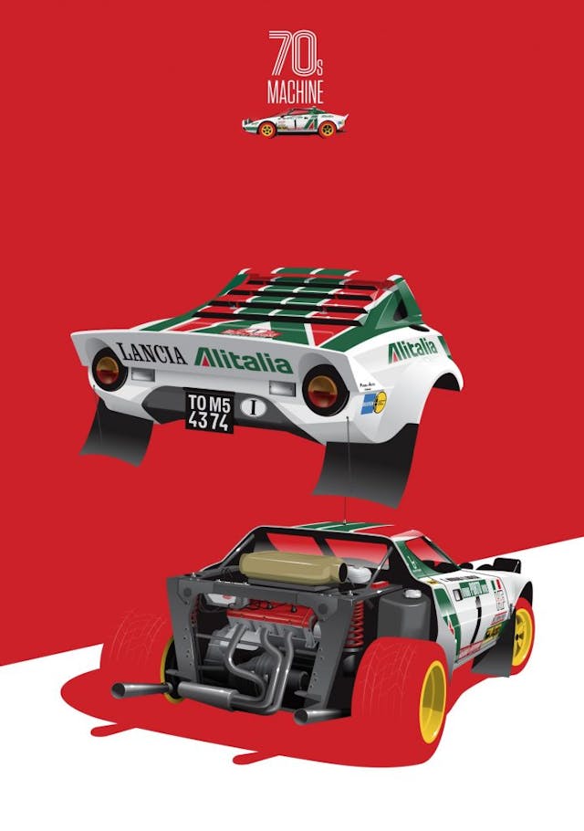
A timeless design by Marcello Gandini, the Lancia Stratos boasted a Ferrari engine and the unmistakable colors of the Italian airline Alitalia. Perfect. This is more of a technical illustration than a graphic one. The idea was to demonstrate the technical aspects of the car, which allowed it to compete both on normal public roads and on forested dirt tracks. In the process, it became a rallying legend.
McDonnell Douglas DC-9F Lancia Stratos
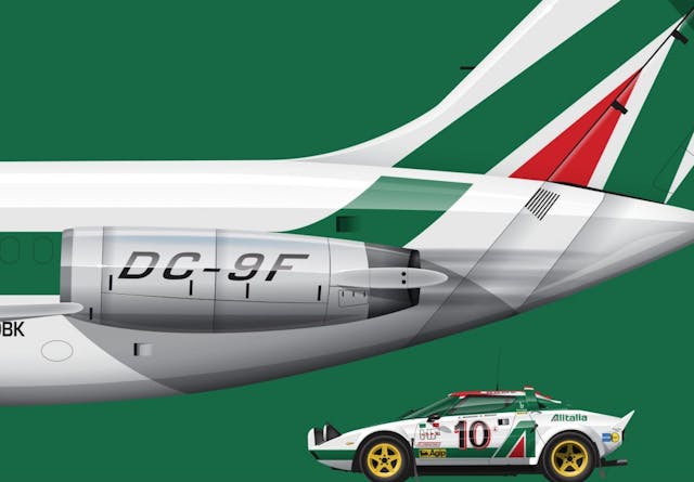
This illustration is part of a work I did with some of the most important cars that used the Alitalia colors. Here you see the Lancia Stratos and the tail of the McDonnell Douglas DC-9F with the livery that was equally and masterfully used on the racing cars. There’s nothing more effective in terms of graphics and communication.
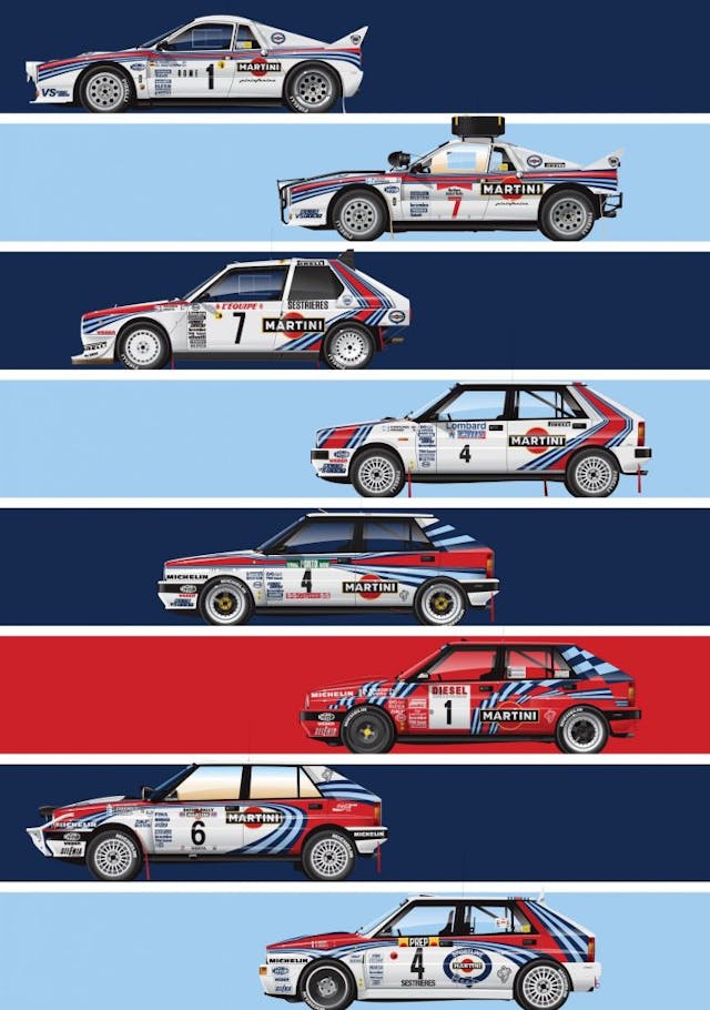
Martini Racing
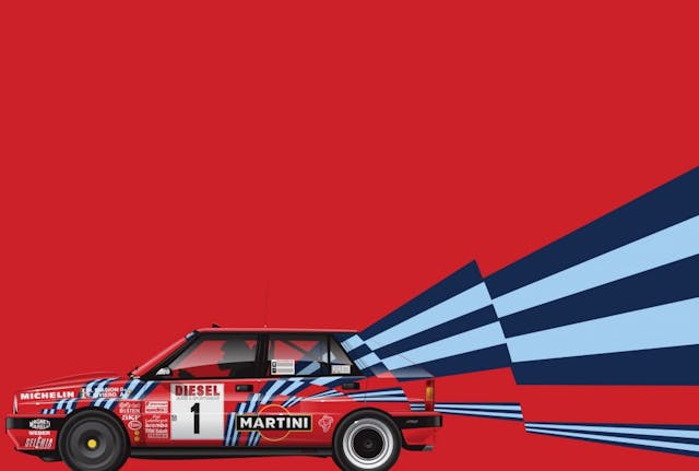
Martini Racing stripes are probably the most famous racing car livery in the world. Immediately recognizable, the livery makes any racing fan delight. In my illustrations, it allows for a countless number of combinations, whatever the car, year, or competition. I love it.
This red Lancia Delta Integrale was used only in one race, the 1989 San Remo Rally. Normally, cars with Martini sponsorship were painted white, but the marketing department of the Italian vermouth brand wanted to try the red background. The idea didn’t work very well—at the time, many photos and publications were still in black and white, which caused the car to have little contrast between the background color and the Martini stripe colors. This idea was corrected at the next race, with the return of white as the background color of the car.
An unforgettable association, Lancia and Martini. So simple and effective, yet so strong graphically and in brand communication.
Martini was also linked to Porsche. Curiously, in this work, I thought the Martini stripes looked good inside the car’s shapes instead of extending them through the background of the illustration. I just wanted to highlight the simplicity of the graphic concept behind the Martini graphic image and the beauty of a Porsche racing car.
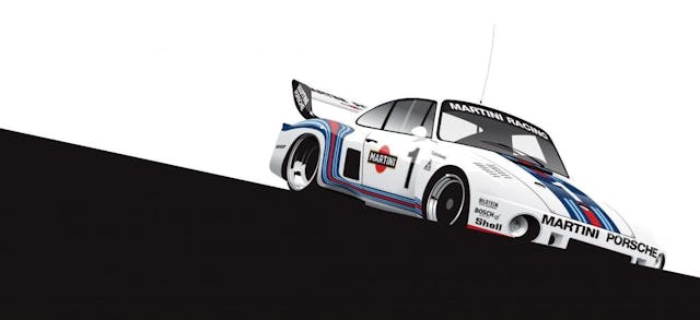
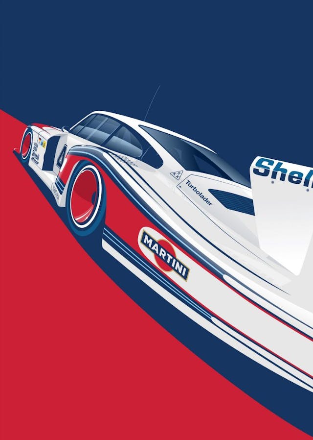
The Porsche “Moby Dick” is another iconic racing car. In this illustration made for Racer magazine, I wanted to highlight the huge tail of the 935 by using an angle that didn’t deform the car too much but which allowed for some exaggeration in the size of the rear. All this accompanied by Martini colors, of course.
Plymouth Superbird
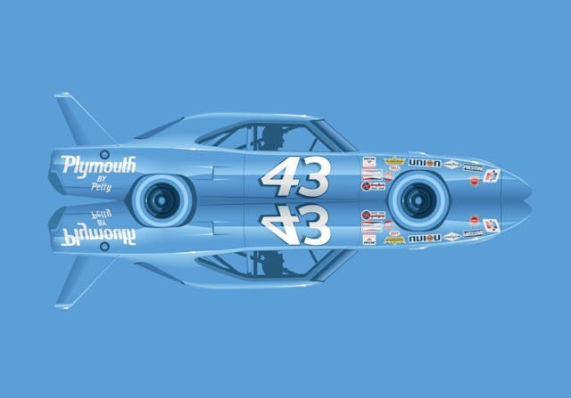
The Plymouth Superbird is one of the most recognizable American car designs. It always reminds me of a rocket ship, so I did this exercise of having the Superbird in a kind of mirror to reinforce the idea of a car that could be launched into space. The fact that this NASCAR version, which was driven by Richard Petty, is painted in only one color makes it so simple and immediately recognizable.
Gulf
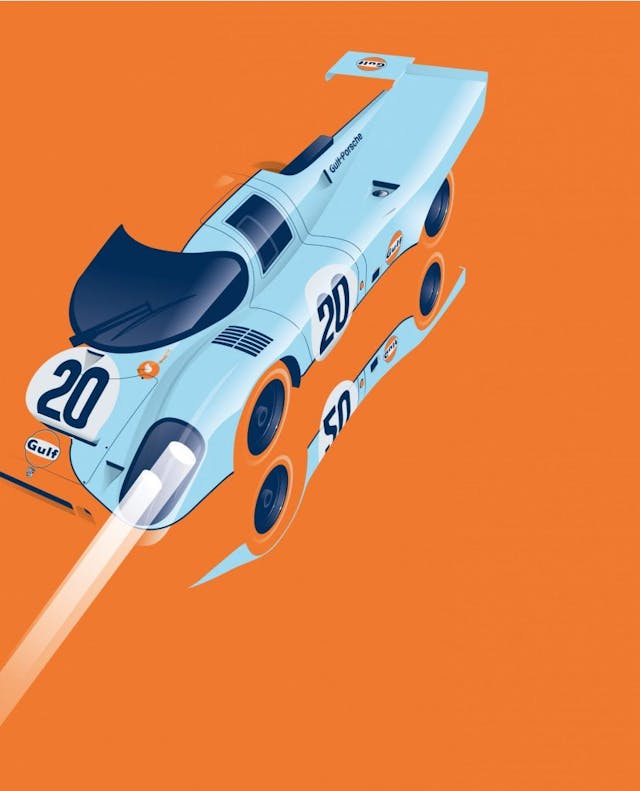
Graphically, the Gulf livery was not an example of creativity. They simply used a stripe in the middle of the cars, just like many racing cars of the time used the colors of their countries. But what makes the Gulf graphics line so special and recognizable are the colors. That contrast between baby blue and orange works perfectly.
In this illustration, I tried to represent this successful formula of color use, putting even more emphasis on the orange to try to reinforce the idea of how well a race car looks painted in baby blue, even though it is an unaggressive color for a race car.
***
Visit ricardo-car-artwork.com to view more of Santos’s art and to purchase prints.
Check out the Hagerty Media homepage so you don’t miss a single story, or better yet, bookmark us.

