Vision Thing: When great design goes bland
Of all the current prestige television dramas floating around at the moment, my favorite by far is For All Mankind. It’s an alternate history drama hinged on the concept that the Soviet Union was first to land on the moon, feeding the flames of a space race and cold war that never ended. The first season was terrific once I got into it, but the second was as good a series as I have ever seen on television. The last episodes were thrilling, horrifying, and tragic in equal measure.
When the trailer for the third season appeared, I had this feeling that things were about to go downhill. Sure enough, they did. Don’t get me wrong—For All Mankind was still immensely enjoyable in its third season, but the story’s slight shift toward character melodrama and away from dangerous space-based adventure unbalanced what was once a winning formula.

That’s part of television, which in modern times is particularly ephemeral and ever-evolving. But think about how often you’ve read a book or listened to a track by creator with which you were unfamiliar and then investigated the rest of their work? When something speaks to us, it’s straight to Wikipedia to read the entire entry and then on to the nearest book or record store to vacuum up the rest of their oeuvre. Then, at home, we’re peeved to discover they’ve left aside the thing we loved and gone full Spinal Tap by taking things in some weird new free-form-jazz-odyssey direction.
Bloody creative types. Stop changing it up for the sake of it and just do the thing we all liked in the first place!

Car design is not much different, although it’s not the creative ego that ultimately drives change, even when a new chief takes over marker duties. The state of corporate finances, external market forces, model replacement and marketing strategies, the emergence of new technologies and features, the inexorable march of time—the combined influence of these factors is very powerful. An initially brilliant, groundbreaking design has to last several years in showrooms, and as the constraints and priorities of the project change, things somehow go from Use Your Illusion I & II (should have been one album; discuss) to Chinese Democracy.

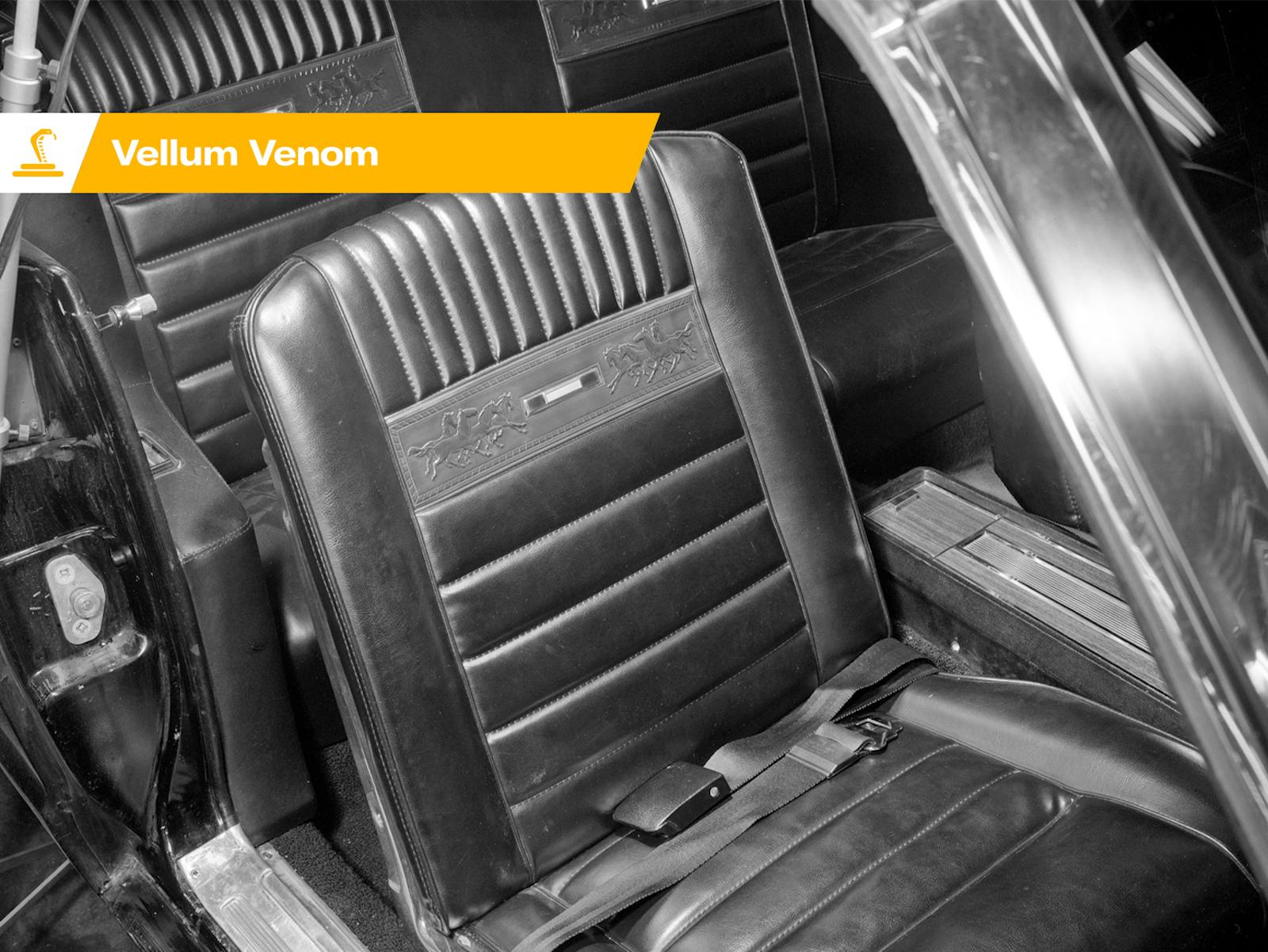
In terms of design philosophy, anything new that appears should be an improvement on what came before. The 1984 Ferrari Testarossa’s intent was to remedy the faults of its predecessor, the 512 BBi, which suffered from a lack of luggage accommodation and a hot, cramped cabin. Moving the radiators rearward from the nose gave the car its signature hips, and legislation around the size of bodywork openings necessitated those oh-so-Eighties strakes, continuing a theme that began on the Mondial and culminated on the 348.
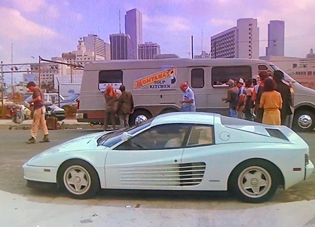
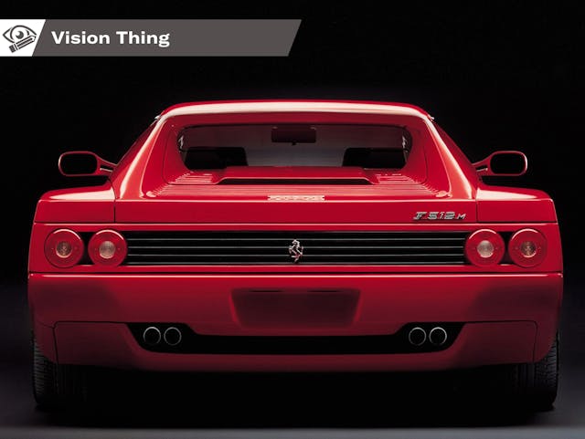
It wasn’t classically beautiful in the grand Maranello tradition, but man alive, if ever a car captured a cultural moment in time, the Testarossa was it. Instantly iconic, it was immortalized in Miami Vice and Sega’s Out Run and untold thousands of bedroom walls all over the world. It made its compatriot, the Countach, look like the relic it was. But the Testarossa, as a result of it’s size and relative comfort had a weight problem—it was at least 500 pounds heavier than the wedge from Sant’Agata Bolognese. It got a subtle facelift in 1991, becoming the 512TR, but like an aging celebrity the surgery eventually went too far. For the Testarossa, that moment came in 1994 with the F512M (modificato).
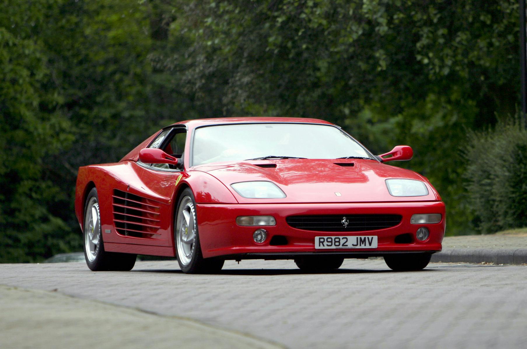
Attempting to give the rear a more family resemblance Ferrari binned the distinctive black lateral strakes at the rear and hidden tail lights and fitted four round light units instead. As on the F355, this didn’t work because both cars were never designed with this style of lighting graphic in mind. But worse happened at the front. Desperate to shed fat the pop up headlights were swapped for incongruous projectors with a cheap looking clear lens, totally the wrong shape for the nose.
If you hadn’t worked it out, I don’t like the F355 either. Heresy I know, but listen up. The Testarossa and 348 were both designed around a very clear set of visual ideas, and had a distinct appearance because of it. The redesigning of both cars into the F512M and F355 respectively were ham fisted attempts to superficially update their appearance without considering their overall form. You could argue Ferrari was constrained economically, but by now they had access to Fiat’s checkbook, so that’s no excuse.

And the best looking Testarossa of all? A stunning silver over white one-off spider built in 1986 for Gianni Agnelli, a man who knew a thing or two about style.
It’s not just Ferrari. Jaguar is a company seemingly always constrained by poor finances and never more than one bad decision away from financial ruin. Fortunately, during Jaguar’s early-2000s purple patch the company had Ian Callum doing the drawings. He had a couple of masterpieces from his time over the road (literally: Jaguar Land Rover and Aston Martin share an approach road at Gaydon) but he drew another hit in the form of the 2014 F-Type.
Squat and muscular, the F-Type combined Jaguar curves with taut, subtle feature lines. He even managed to make the grille shape work with a low sloping hood. It’s one of those designs that was perfect from the get-go. Nothing added or taken away could possibly improve it.
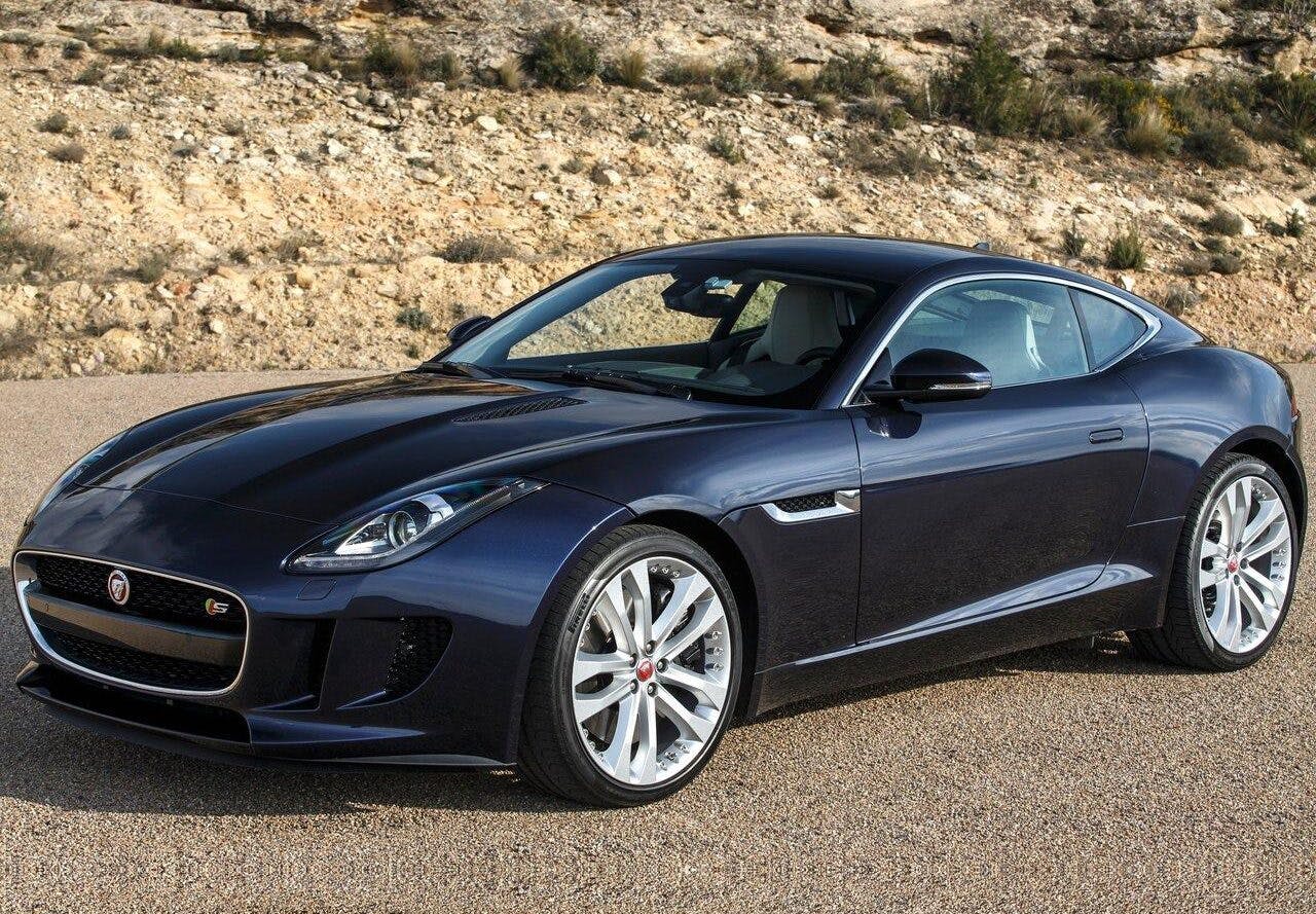
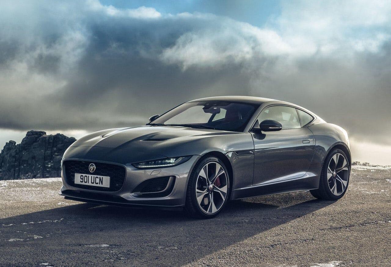
The problem for this cat was that it was oddly positioned in the marketplace, sized slightly bigger than a Boxster without the advantage of dual trunks and priced like a 911 without the advantage of +2 rear seats. Proof that British Leyland casts a long shadow over its children, Jaguar constantly mucked about with different powertrains and confusing trim levels in an attempt to broaden its appeal. The most recent (and final) facelift two years ago changed the F-Type’s fearsome headlights for a blandly generic and squinty look.
Again, this change was supposedly intended to align the F with the rest of the Jaguar family, but all it really did was neuter its feline visage. Both the Testarossa and the F-Type (when it finally dies next year) enjoyed quite long lives, 12 and 10 years respectively. That’s expected with this sort of car, because when you don’t have to sell as many they tend to stick around longer. The way to plan around said longer shelf life investing the effort into a timeless design that is impervious to the whims of fashion—something comes naturally to lower-volume OEMs because they have the time and the talent to nail it on the first time around.
A really great, fully considered design should be protected against tinkering, because each element works toward creating the whole. Trying to nip/tuck them is like wearing a Savile Row tailored suit and shirt with a Daffy Duck tie. Have the courage of your design convictions!
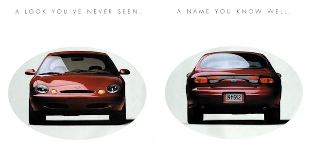
Of course, that applies best if your convictions are correct in the first place. The original 1986 Ford Taurus was a groundbreaking car. A slick modern aero take on the heartland American sedan, it was a genuine revelation in appearance and packaging. When Ford was getting ready to introduce the third-generation Taurus in 1996, it wanted to repeat the success of 1986 all over again. Thing is, the competition had gained a lot of ground since the mid-’80s. In the intervening years both Accord and Camry had moved things on in quality and driving experience, the Chrysler LH cars in interior space and packaging.

Ford put a tremendous amount of effort into the ’96 Taurus (well documented in Car by Mary Walton, a must-read) but it was so committed to giving the car a stand-out that designers went with a strange ovoid theme, splashing the shape everywhere inside and out. The oval motif wasn’t really the problem as much as the awkward proportions; not how the hood and trunk melt away from an oversized glasshouse.
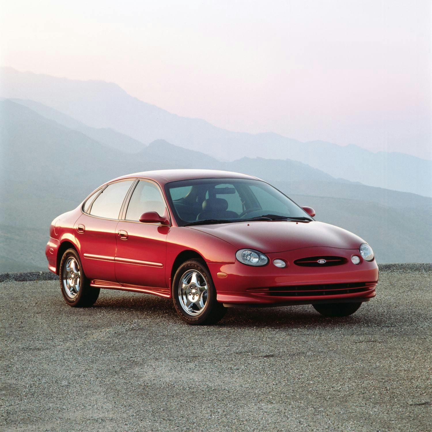
Despite the fact it was by most accounts a pretty decent car, only four years later Ford sought to flip the script on dwindling sales by updating the 2000 Taurus. Things went a bit awry. Ford moved away from the oval graphics when it should have paid more attention to the volumes. The result was a decontented, featureless transportation box that traded identity for anonymity. Sales cratered even further, and the line was discontinued six years later. A good run for a mainstream car of this sort, but the later cars never managed the stand out the way the early ones did.
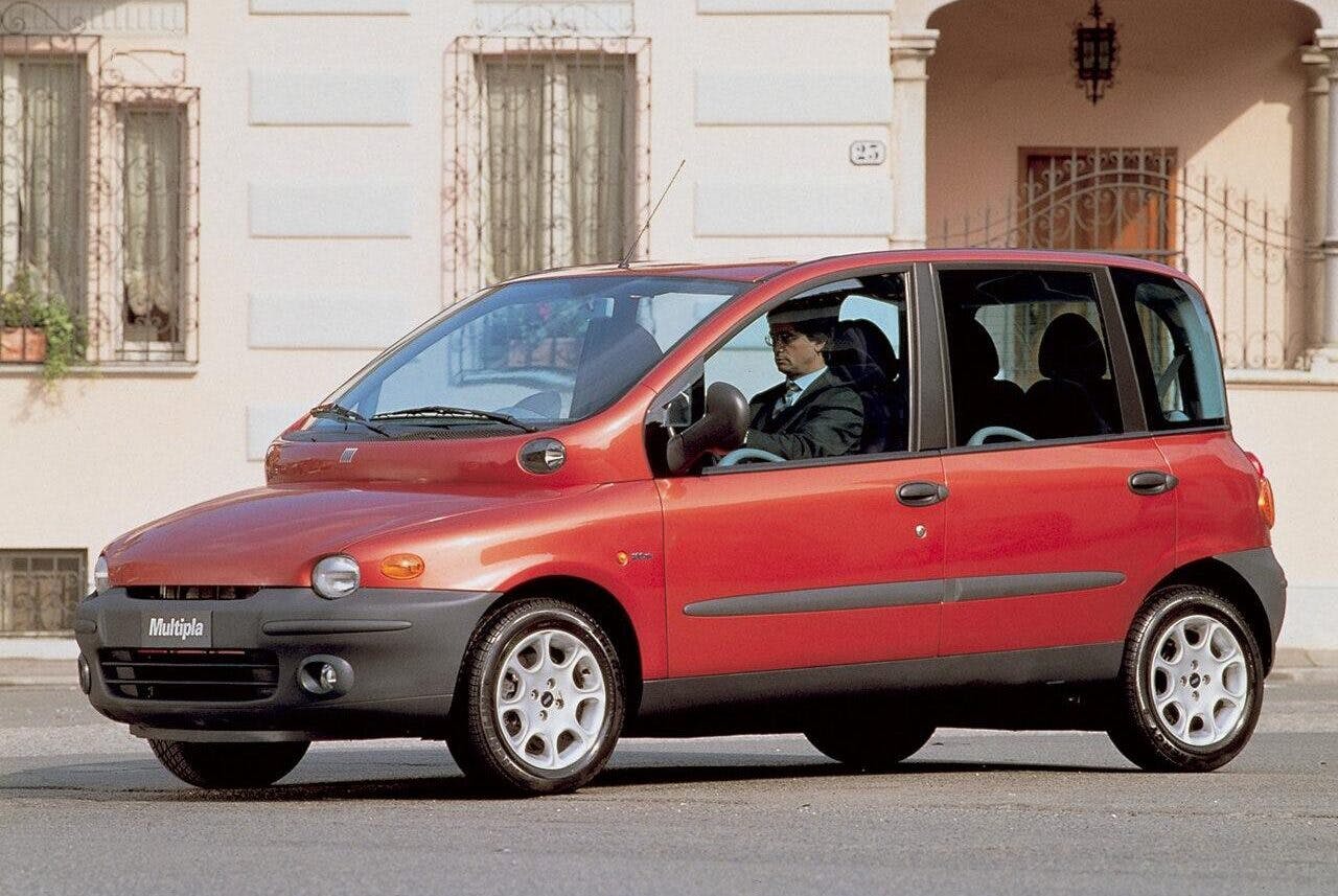
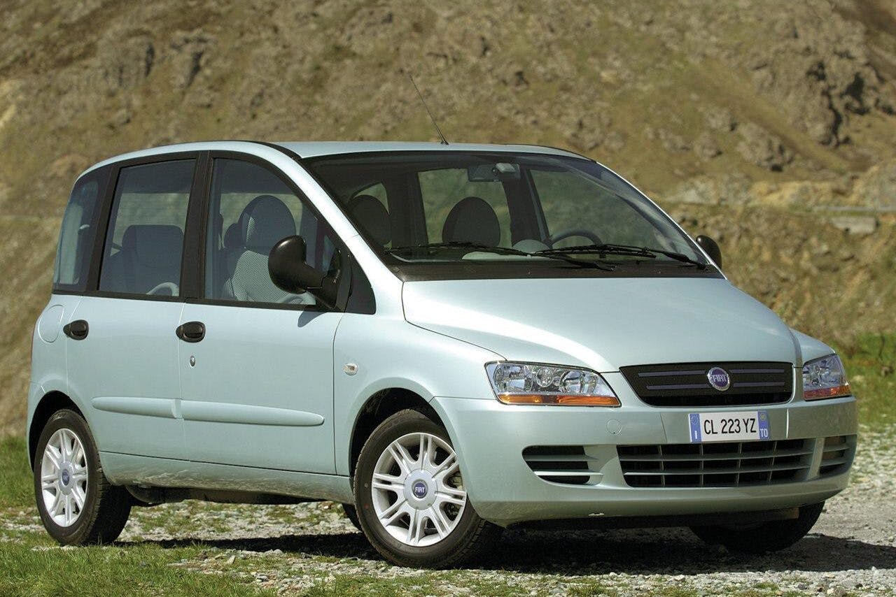
The 1998 Fiat Multipla regularly appears on lists of ugliest cars ever, and to be fair it is a bit out there. But it’s so joyfully bonkers and has a keen sense of humor about itself. In the U.K. ,dealers even stuck a “Wait until you see the front!” sticker in the rear windshield, suggesting they were in on the joke. Don’t let all that fool you though, the Multipla was a tremendously clever car—seating for six and their gear in the footprint of a sub-compact. The interior was a riot of color and playful ideas including a combined instrument cluster and gear shift on a central binnacle angled toward the driver, a central front seat that could fold over to become a table with cup holders, and enough odds-and-ends storage to lose your sunglasses for a week.

It struggled for sales, but the people who bought them really, really loved them. Today they’re something of a cult classic. Because of slow sales in 2004 Fiat “did a Ford” and gave the exterior sheet metal a much more conservative appearance. Like the Taurus, sales sunk.
The Ferrari and Jaguar are perfect examples of change for the sake of it. Premium makers should carefully nurture and finesse their work only when absolutely necessary, i.e. with the introduction of a new model. Otherwise they’re like Marge Simpson with her ever-altered Chanel suit. The mistake Ford and Fiat made was thinking that individuality was putting customers off. By attempting to make their cars more palatable they erased everything that made them unique … which is the reason anyone bought them at all.
When models used to update car design yearly, the approach was more akin to a collage in which shapes, and trim arranged and rearranged every twelve months. This became unsustainable as development costs rocketed in the Seventies, and in retrospect it was an incredibly cynical and shortsighted way of doing things. Nothing was allowed to settle or develop into a part of the automotive landscape. Car identities were constantly shifting and swaying according to what the dealers thought the customers wanted.
It’s much harder to sympathetically alter a car’s appearance nowadays, because car design is a jigsaw rather than a collage, with complementary pieces fitting together as opposed to a collection of trim and features jiggled about on a yearly basis. An upside of the old way is that if you didn’t like this year’s offering, there would be something new next fall. Of course, as we know from TV, that doesn’t always mean something better.
Check out the Hagerty Media homepage so you don’t miss a single story, or better yet, bookmark it.

I think Bentley, with the Continental GT, has managed to keep the design integrity through all 3 geneations of the car. The current, 2023 model, still looks like the 2003 model, yet it is an entirely different car.
It’s probably even better now. I think the original had a little too much Volkswagen in it, and it was pretty decontented to keep the price down (relatively speaking – a friend has one and I’m constantly surprised by the lack of standard equipment even though the build quality is impeccable). The latest model has shifted the front wheels forward for a better dash to axle which helps the proportions a lot (I mentioned this is]n an earlier column).
You – “It made its compatriot, the Countach, look like the relic it was. ”
Me, scratches head, Googles “1984 Countach”. Nope. I had the right one on my wall. You scared me that perhaps I chose wrongly at the Scholastic Book Fair.
Right on, Isaiah. The words “Countach” and “relic” in the same sentence made me blink and rub my eyes a few times, also. Sorry, but no Testarossa made a Countach look outdated in any way, shape, or form. The overall gist of the article is an interesting read, though.
Having been lucky enough to touch the contours of both the Countach and the Testarossa, it’s pretty clear that one design was significantly refined with subtle contouring even on the hardest edges, while the other was designed using cardboard and an X-ACTO knife. Okay, maybe that’s an exaggeration, but even the interior crudeness of the Lambo is shockingly disappointing, while the Testarossa looks like a proper touring car with modern technology and refinement. Just look at the bumper designs, for starters: one actually retained the original design’s cohesion while working with American bumper/safety requirements.
And you can actually sit comfortably in the superior Ferrari, and it was something worthy of being parked next to a Benz, Rolls, Caddy, etc.
Absolutely this. The Ferrari was a thoroughly modern well engineered car. The Countach was from an earlier era, constantly tweaked and added to as money allowed.
Who are you and what have you done with the real Sajeev (with whom I nearly always completely agree)? Imposter! Charlatan! 🙂
A well known auto journalist has repeatedly put – in print – that Lambo didn’t make a vehicle that was even remotely enjoyable to drive until 2009 lol. Yes, the interior and the seating position in the Lambo left a lot to be desired. I used to valet at a pretty high end yacht club back in the day and there were many testarossas and countachs that I drove – the countach felt like the Flintstones and the ferrari like the Jetsons.
Mechanically and technologically speaking it was outdated. Visually? For me you can’t beat an original LP400 for the purity of the shape – but by the eighties the body kit and wing were making it look a bit tarty. At the time though, yes Countach for me definitely but then I’ve always been a contrarian.
Now THIS is not a contrarian point-of-view, IMO.
And you, Adrian, have used your own words to prove my claim. Your article didn’t mention internals, seating, engineering, mechanicals, technology, – or anything other than “looks”. And now, I respectfully rest my case. (But I will not rest until we find the real Sajeev and oust that clone who has taken his place!) 😛
Both sides of this argument have their validations.
Henry’s Model T stubbornness versus the craziness of the 1950’s.
At some point, though, change either has to happen, or has to slow down.
I think they’re the extreme end of the graph. Model T at one end and fifties planned obsolescence at the other. Henry nearly bankrupted the company but the car building game had moved on and left his ideas behind. Neither approach was sustainable as the market matured and consumers became more sophisticated. But OEMs still misread the market which shows what they think the market wants, and what the market actually wants and will tolerate are often two different things.
Had 90-93-95 SHO’s and test drove a new 96…for the first and last time.
I agree with the F-Type. They ruined an absolutely beautiful design with the new headlights.
“Use Your Illusion I & II (should have been one album; discuss)”
I strongly disagree. Both in period (I bought them both the day of release at my local record store on CD in long boxes) and today, I think they both stand up. Both Axl and Slash said their goal was to “bury Appetite”, something that would be impossible to achieve with only quality, so we were treated to a diverse bounty of quantity. The only track I honestly feel could be a B-side would be the alternate take of Don’t Cry.
Excellent discussion on design though!
The reason they made it a double album was Geffen Records fault – but technically the two “albums” are separated by when the songs were originally written. Go look it up. I went to a record store over the summer one year while in collage and I found two giant posters of the Use Your Illusion album cover. They were 7’x5′ and were just what my fraternity house needed
PS – sounds like you’ve been listening a bit too much to Mick Wall & Jon Hotten 😉
Through a chain of events decades ago I ended up with a 1984 Fender Stratocaster guitar. The model is a ’57 re-issue. It was the beginning of the retro guitar design phase where they sort of gave up trying to innovate new guitar designs (Fender that is) and decided that milking the greatest hits catalogue was the way to go. I think it has been a huge success.
To me this translates into automotive speak with VW Beetle and it’s original long run. Subaru and others with their more recent “evolved generations” approach where you are getting the new version that doesn’t look much different than a previous version (but now less parts fit). Challenger and Charger are the poster children of “make them until they stop selling” and probably would still have a future if not for Stellantis overlords and environmental posturing.
If the 55 chev returned as a catalog model (and truly was the correct dimensions with tastefully done modernization options) that would be interesting to me. So would a late 70s Trans Am, Fiero, 80s Toyota Hi Lux, etc.
Certain things were great in design. I get packaging airbags into a 61 Impala bubbletop would cause issues. I get that you can’t make a Fiero front end anymore. But that 55 Chev… you might just be able to meet the rules without killing the design?
Well, crumple zones…
“crumple zones” would absolutely be the engineering challenge. GM for example only has the truck as a body-on-frame platform. Sure some hot rodders hack up S10 frames to put under 50s cars, but an OEM has a lot of safety regs to meet and I’m not sure you can do this concept with a Silverado frame and any sense of cost-effectiveness or profit.
If it is a 55 chev wrapper, preferably in the correct size, I would happily concede that under the hood and under the car look nothing like the original. Interior you will have compromises for airbags and such, but we have seen high end restomods with modernized looking interiors that look good to great.
This EV age of GM might actually make this more possible (catalog model versions of GM’s greatest hits). I’ve seen some pretty good 57 chev golf carts for example…
Heck, I even have pictures of a ’55 Chevy V-8 motorcycle!
Anyway, the concept is fun to think of, and I might even lend my marketing genius (heretofore unappreciated) to the cause. I mean, many of us hot rodders and classic lovers are constantly complaining about EVs getting forced upon us. And we love ourselves some nostalgic looks. So maybe combining the two will give us some sort of compromising ground. A ’55 Chevy Bel Aire with EV guts and semi-period-correct-looking interior? Might be a good start at that, snailish! Ford and Mopar, are ya listening? You’ve got a few classic designs in each of your stables that might be the next step.
But hurry, Big Three – I ain’t gettin’ any younger here! 😆
Ah, a mention of Gianni Agnelli. Per an article in Vanity Fair:
“A motoring journalist recently observed that the entire sports car industry of the last century was built upon the macho image of a man driving a powerful automobile and attracting the opposite sex. Nobody better epitomised that ideal than Gianni Agnelli, known as “l’Avvocato”, the dashing patrician boss of Fiat; confidant of presidents, princes and politicians; founding member of the Jet Set; and, for much of his 81-year life, worshipped as the unofficial style and business king of Italy.”
The first take is often the best take on most car designs. It’s rare when the facelift improves these days. it usually seems to be change for the sake of change these days. Look it’s new! (Not really!) We moved the kink in the styling over a bit and reshaped the taillights. New!!!