The secrets of old-school signwriting

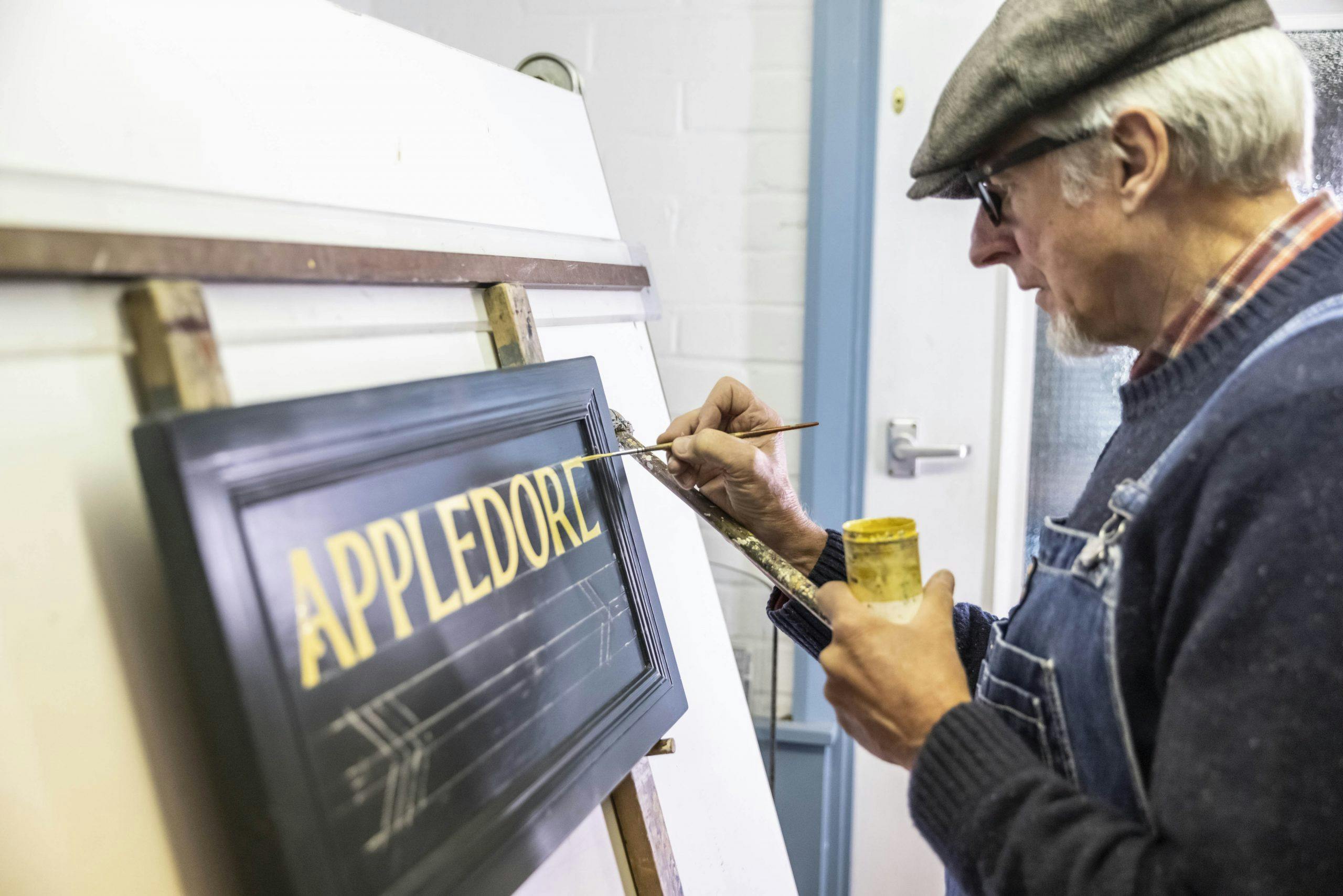
The room is bright and warm. Signwriter Terry Smith stands at an easel, his chest rising, pausing, and falling; each brush stroke is a breath held. He appears entranced, locked into an irregular but comfortable rhythm with his paintbrush, its once crimson-lacquered handle worn to bare wood. A prickly whiff of paint thinner hangs in the air.
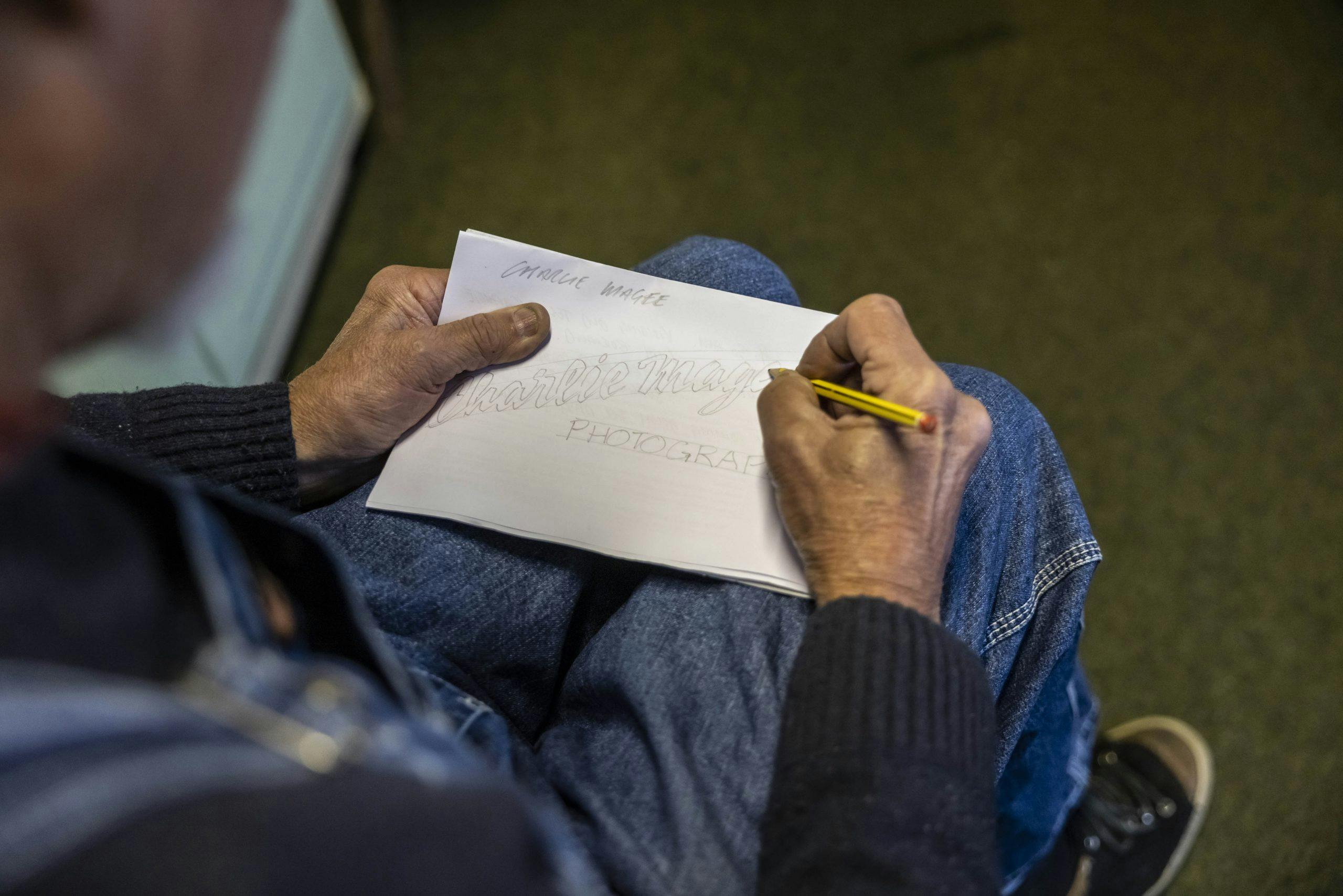
Working from left to right, Smith supports his painting hand using a mahl stick, which he calls his third arm. Its round, padded head glides across his work surface, collecting chalk dust from the positional renderings he uses as a spacing guide. In signwriting circles, this known as the pounce method, but Smith doesn’t rely on it.
With the brim of his flat cap resting on the frame of his glasses, his eyes are cast in shadow, but I can see them darting, repeatedly, to his right. “I’m projecting the finished letter in my mind’s eye,” explains Smith, who has been signwriting, the traditional way, since the mid-’70s.
“I won’t follow the chalk marks—they show me where I need to start and finish, but it’s up to me and my brush to get it right. If you can’t freehand when painting lettering, you won’t earn a living out of it. It’s a sixth sense that’s difficult to teach.”
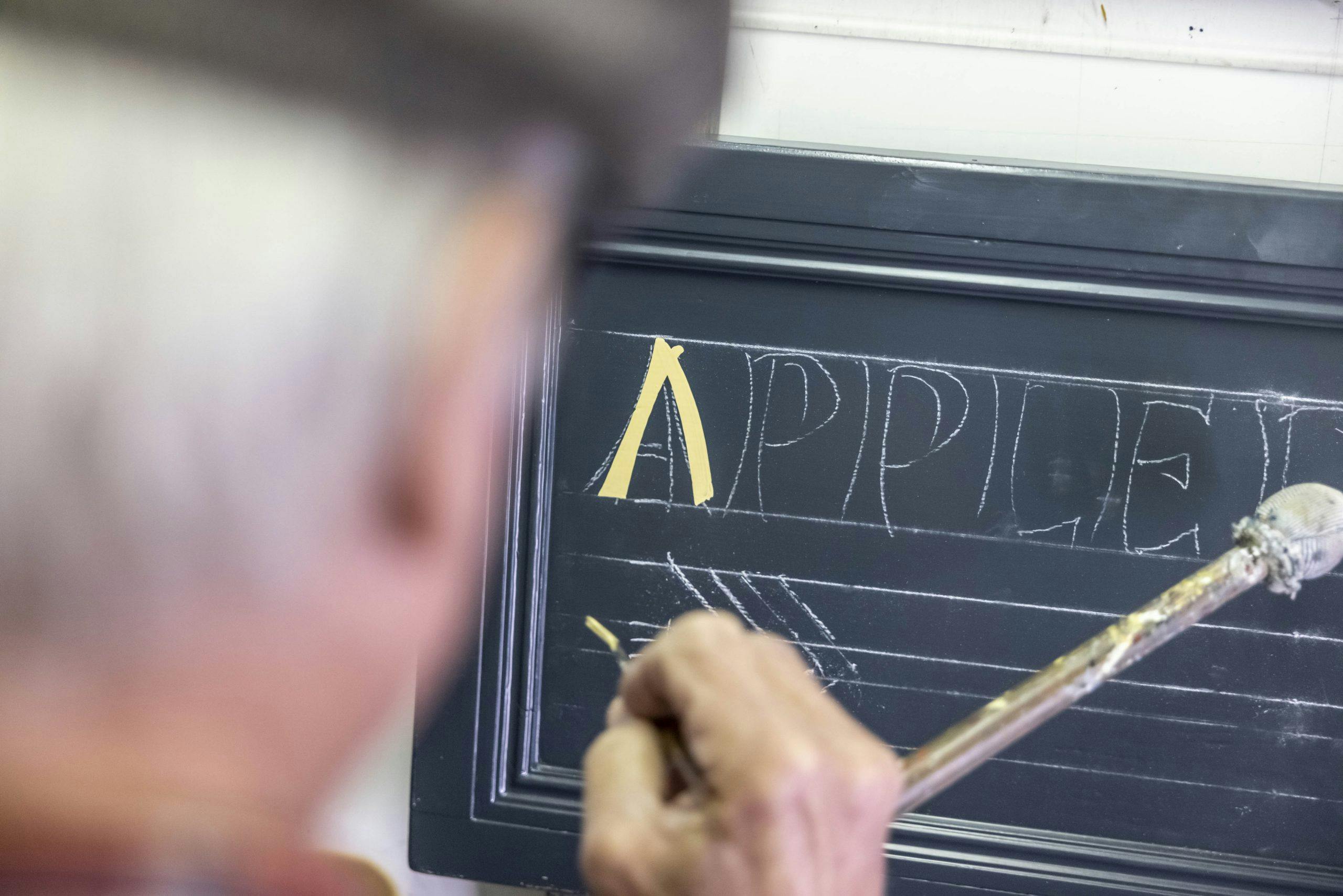
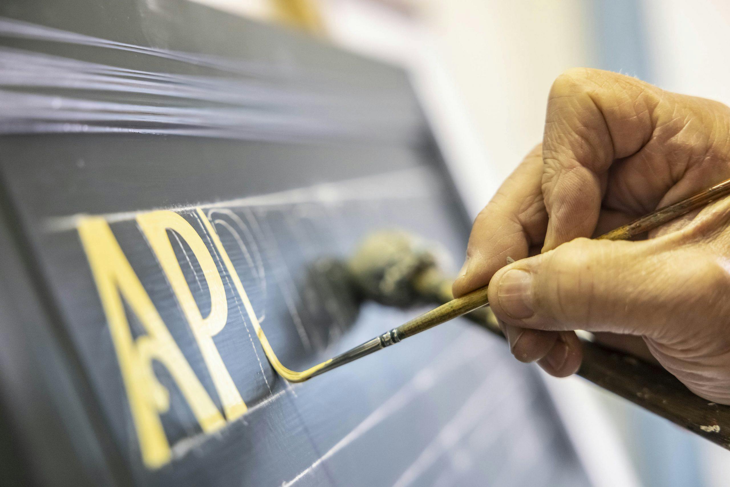
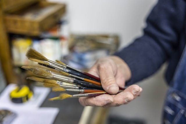
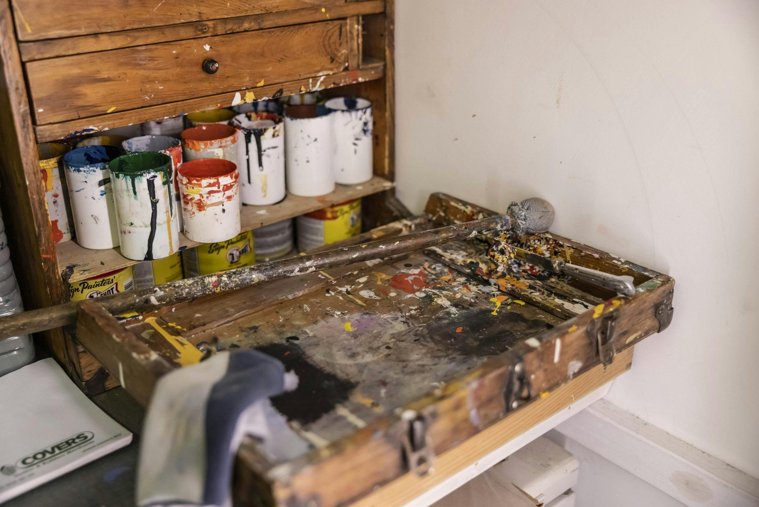
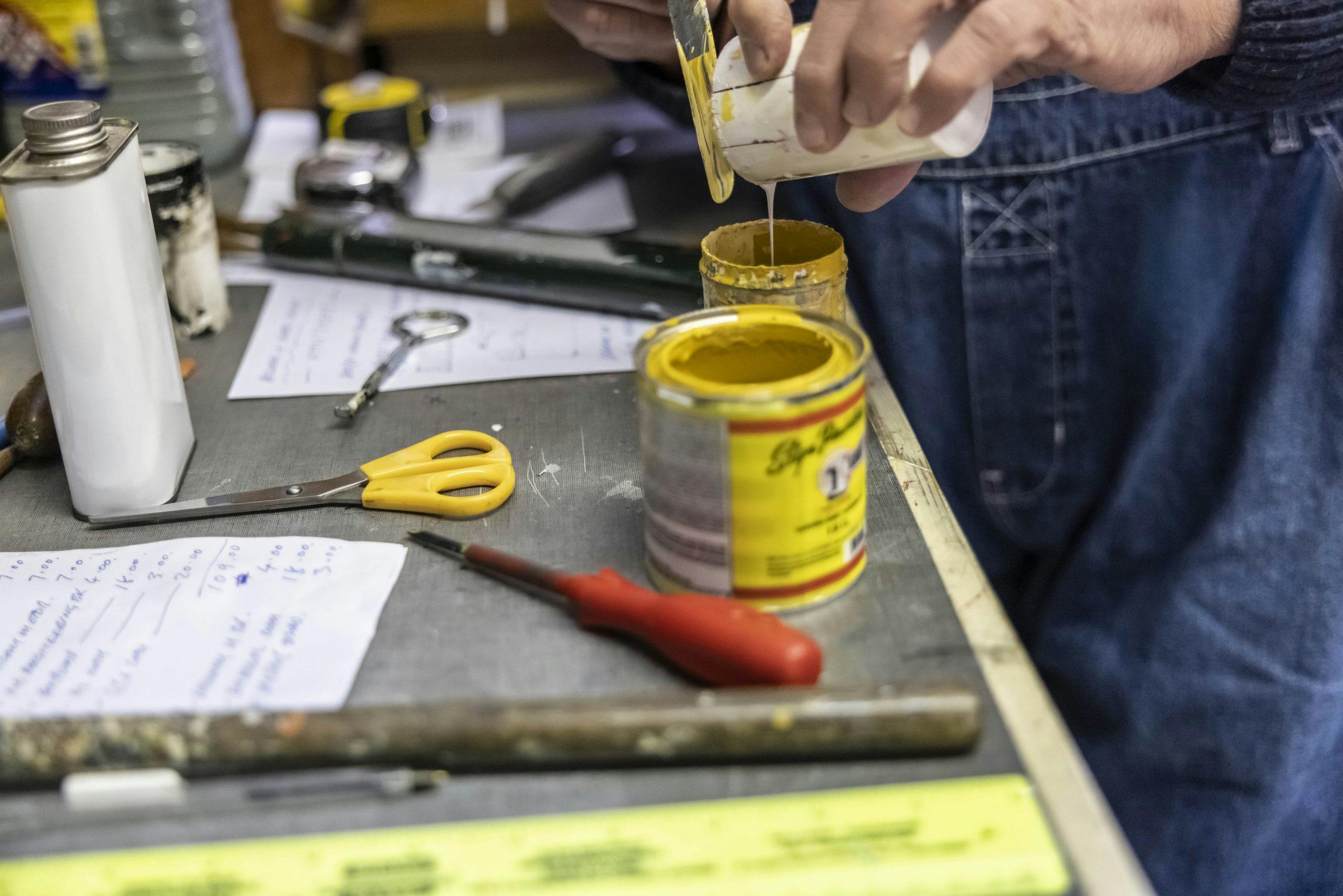
Using the inside edge of a paint pot as his palette, Smith manipulates the bristles of his brush with a series of strokes to find its “sweet spot.” All brushes, he says, have a point at which they perform their best because of the way their bristles have been laid and fastened. “When you use them day in, day out, you get to know what they’re capable of.”
From tip to tip, an artist’s paintbrush comprises three main parts; head, ferrule and handle. Each brush’s specific anatomy, such as size and brush shape makes it a character in its own right, says Smith. Once you know how to get that optimum chisel, he says, the brush give you what you want. “By making friends with them you can get the best result from them, but if a brush starts to shed its bristles, it’s had its day.”
Gradually, letters emerge from a mesmerizing sequence of swirls and curls and quick-fast flicks. With a lift and a twist, Smith adds a flourish to the foot of the final letter. He paints those impeccably straight lines with a tremble in his hand. Undetectable to the naked eye, it’s not an ailment but a deliberate and exacting technique that helps persuade paint to part ways with a brush; think of it like a singer’s vibrato.
Had life panned out a little differently, we might not have been on our own in Smith’s studio. Of his two sons, it’s the one who emigrated to Australia that inherited his creative flair. The final project they worked on together was a mural of the Brighton Belle electric train; it remains Smith’s largest single work to date. Spanning over 50 feet, it occupies three panels set into the arches of the forecourt in England’s Brighton Station. The project took five weeks for them to complete. “I miss bouncing ideas off each other,” says Smith, as he sets down his paintbrush. It’s time to take a break.

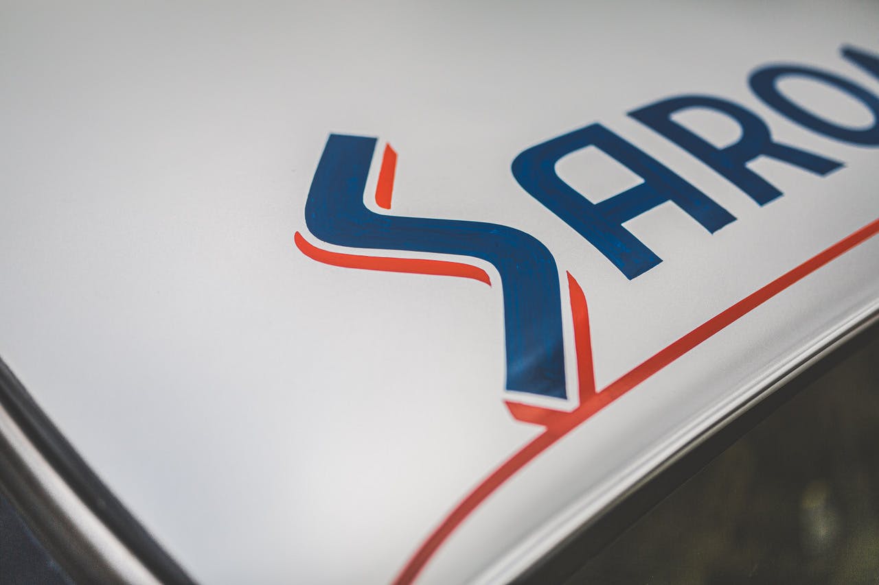
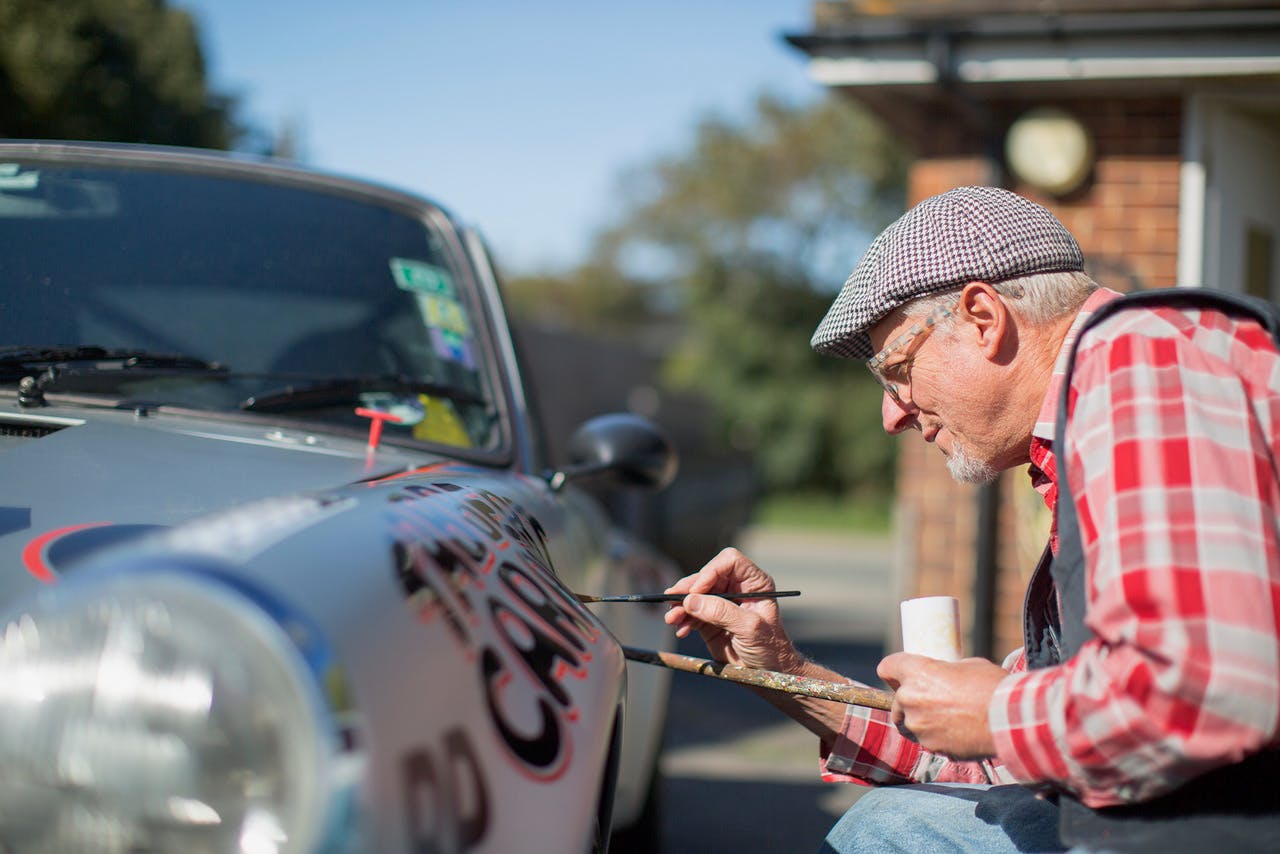
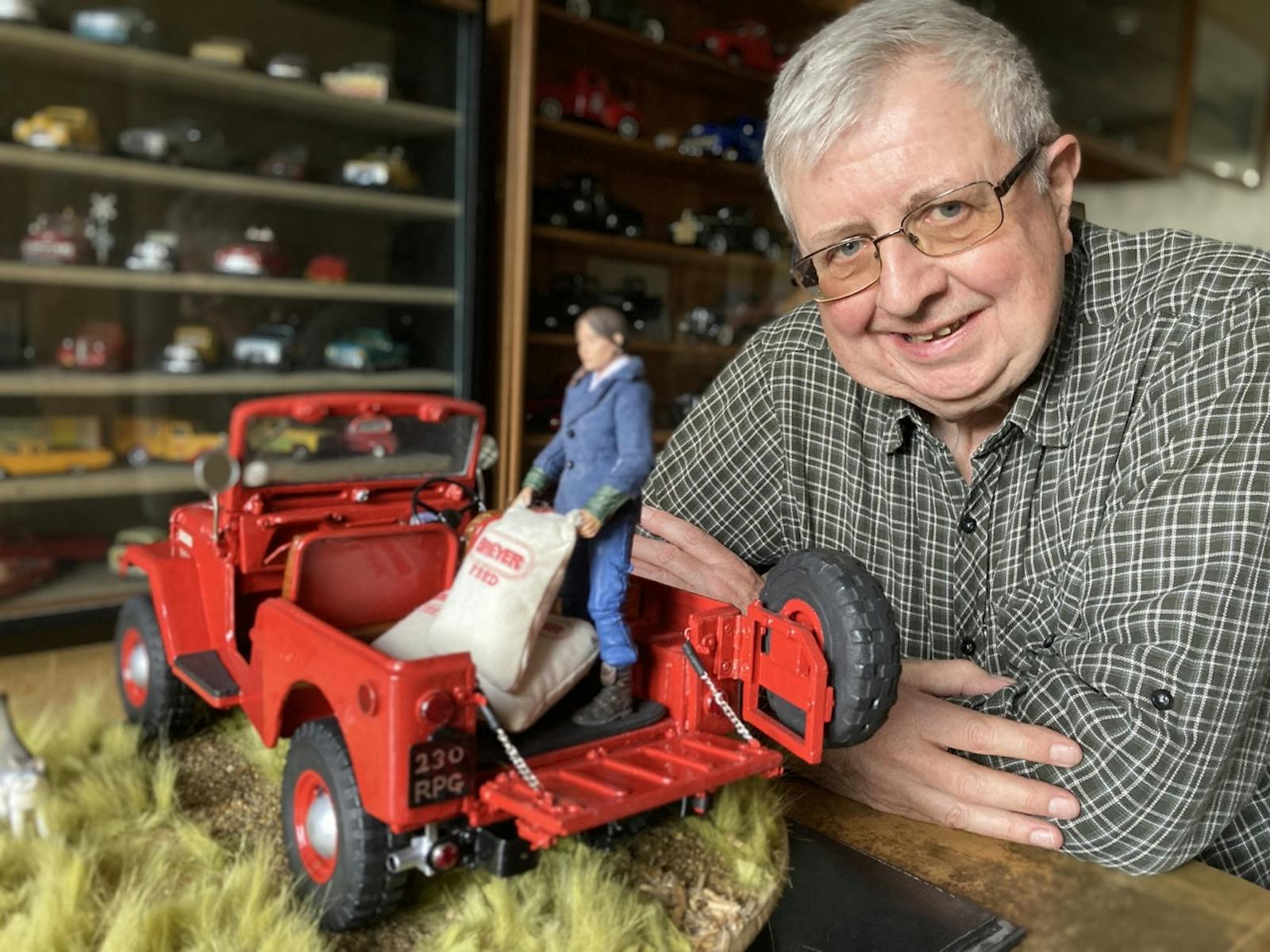
Over black coffee and chocolate biscuits, Smith pores over photographs of his signwriting accomplishments. They include scenes from Goodwood’s Revival—“I paint the ‘Gentlemen, start your engines’ kind of stuff”—and a restored 911 that was used as a promo car for Private Motor Club magazine. It’s a commission that he’s particularly fond of: “The livery was inspired by a Porsche that raced Le Mans in 1972,” he explains. “When signwriting a car, you have to ignore its curves because you want the artwork to be true to its original design and form; you don’t want to elongate anything whether that be lettering, a logo or an image.”
With steam rising from his cup, Smith recalls a “bitterly cold” assignment that took place in a dusty Dutch barn. On occasion, he admits, his paintbrushes have played second fiddle to his portable convection heater. Cold hands are not conducive to effective signwriting.
As he flips through this deconstructed portfolio of work, Smith explains why he refuses to post on Twitter, Instagram, or Snapchat in order to attract new business: “My reputation and word of mouth seem to do the trick and I’ve won more jobs doodling on the back of an envelope than any other way. Over the years I’ve walked into shops, picked the pencil out from behind my ear, roughed something up, and bingo, I’ve got the job.” He has no website or email address to his name: If you want to make inquiries you’ll have to contact Terry Smith Signwriting the old-fashioned way; by picking up the phone.
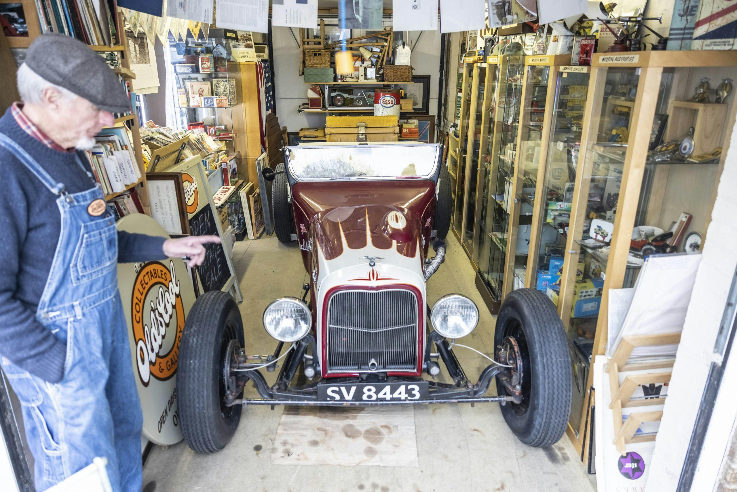
He eats lunch overlooking fields that fall away into the sea within four miles. Home, for the moment, is a bolt-hole in West Sussex, but fundamentally, it’s wherever Terry parks his VW camper van. Bearing the same sign-written name as his automobilia shop, “Old’s Cool,” the van is the place where he reacquaints with his nomadic self. In 40 years, Smith has relocated 13 times, but his current casa—a converted police traffic control office with a trio of outbuildings that once housed panda cars and are now in service as a signwriting workspace, garage, and store front—is ideal.
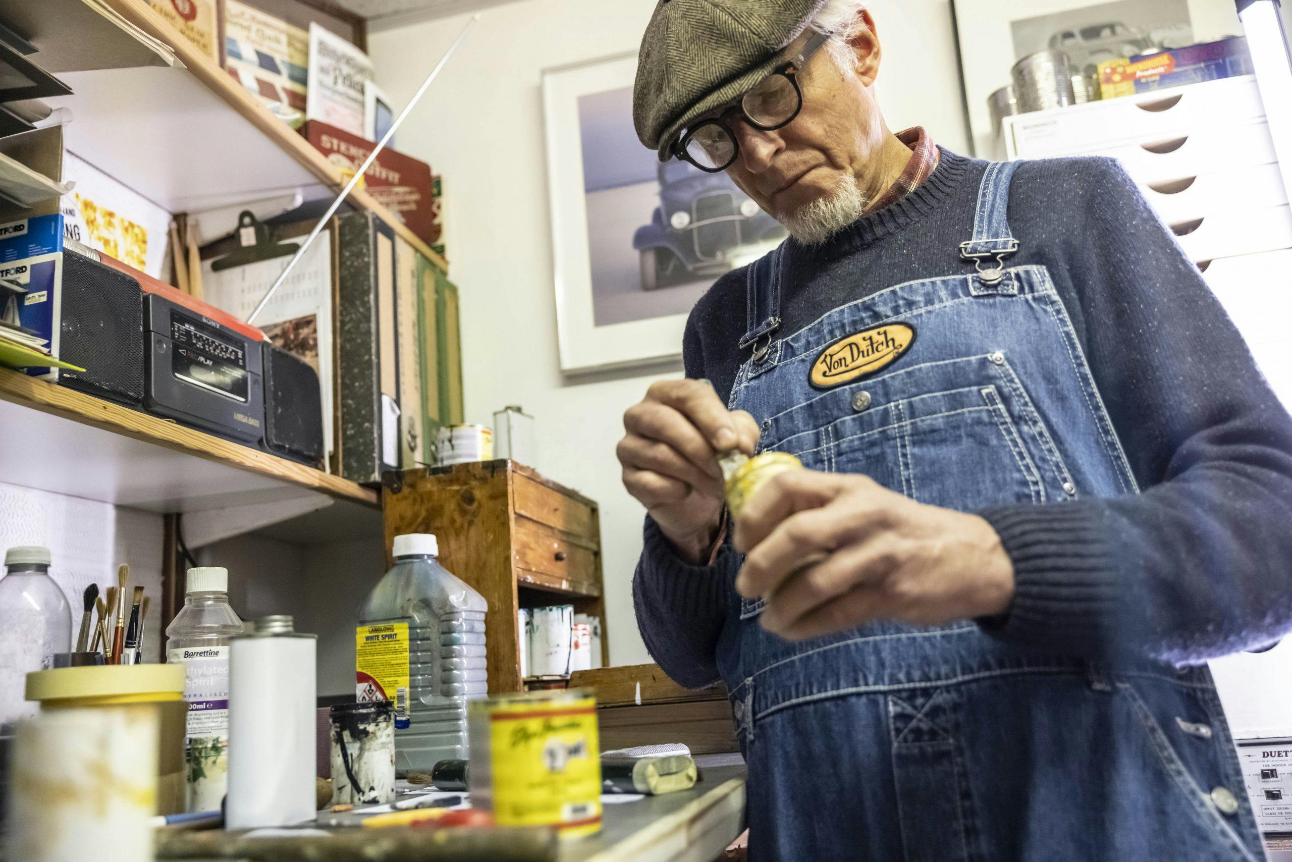
It was several studios ago, back in the ’80s, that a salesman first came knocking at Smith’s door with a vinyl cutter. “I said, I’ve got a project for us to do,” recalls Smith, his tone hinting at mischief. The mano a mano that followed, he tells me, was a civilized competition between craftsmanship and computer.
“After he’d set his machine up, we started at the same time and we finished at the same time. I then said, ‘Well, there you go bud, that machine is £10,000 and I’ve got to buy countless rolls of vinyl to feed it. I mix my colors by eye, in a thimble, for what I need to do the job.’” The salesman countered Smith’s appraisal with the argument that vinyl is more efficient because it doesn’t involve drying time. He didn’t convince Smith.
“I instantly decided I wasn’t going to subscribe to it. I wanted to keep going, hoping that there would be a nice little niche for me to inhabit.” He continues with a word of caution: “If you’re even thinking about vinyl, I’m not your man. This is a different thing, this is hand done. I also don’t price it per letter, this is not like putting an ad in the newspaper.”
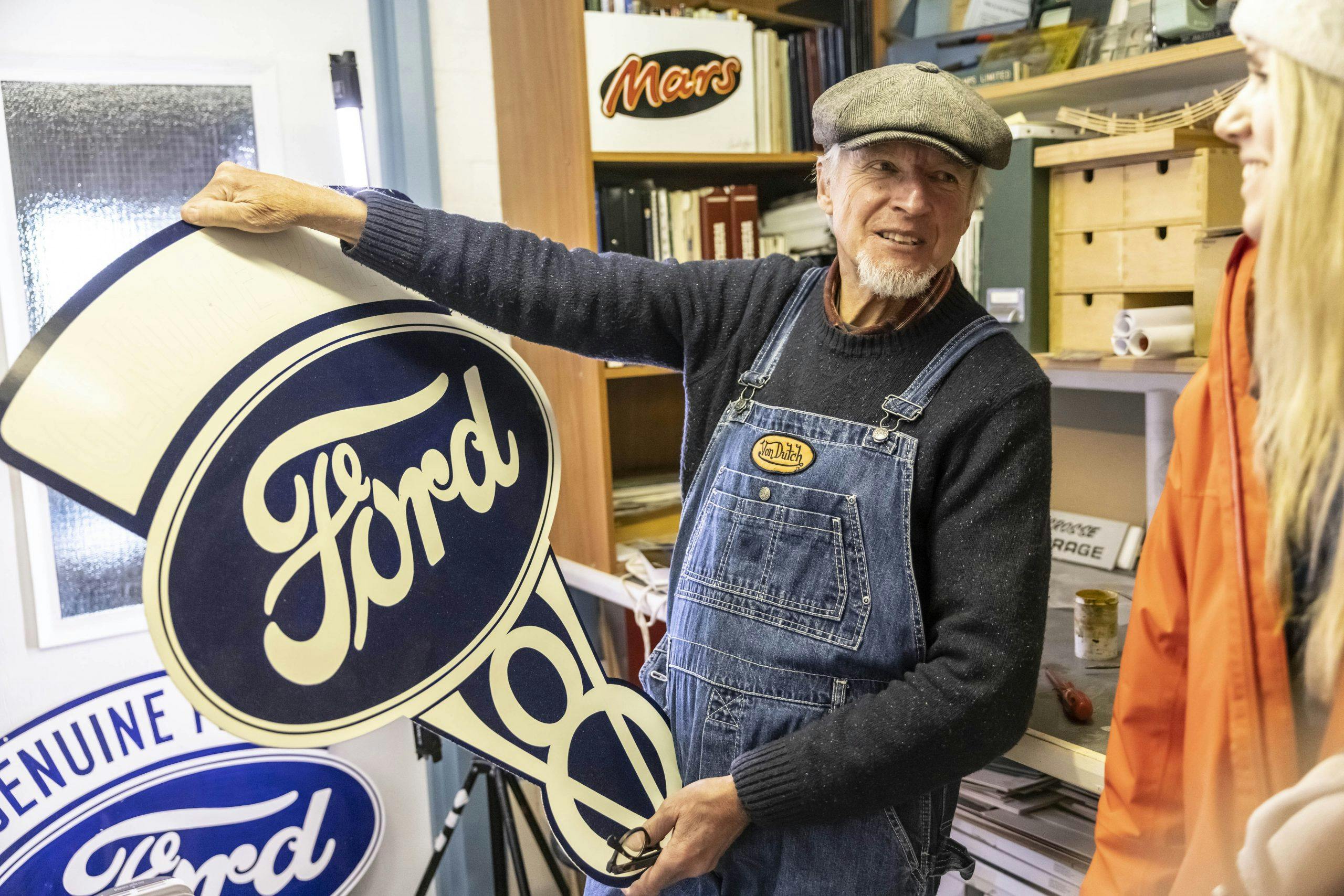
For centuries, buildings, boats, and all forms of transport have been distinguished by hand-painted signs. Once upon a time, Smith says, “You’d see a signwriter in a high street, they were as common as decorators or plumbers.” He’s a stickler for period correctness. “If an object pre-dates vinyl, then it absolutely shouldn’t wear it. If it’s a vehicle I’m signwriting, I match its vintage to a typeface from that era. The vinyl boys often get it wrong, plumping for something they see on a screen that wasn’t even designed when the object they are working on was built.”
Smith laments the days when a recognized qualification in signwriting could be obtained at the City & Guilds of London Institute: “Now it’s just left to nutters like me to drum it into people.” Back then, he says, a true signwriter could distinguish subtle differences in the handling of lettering that made it identifiable as an individual’s work. “The process of vinyl printing is genius, but to call it signwriting is a travesty. That’s why I call myself a sign painter these days.”
To nurture newcomers to his craft, Smith runs courses and hosts workshops at the Brighton Fishing Museum, West Dean College of Arts and Conservation, and at home. He hopes to discover someone who has got what it takes to inherit his paintbrushes. If you sign up, be prepared to switch off: “I wouldn’t dream of having a mobile phone in my studio—the last thing I want when I’m in the zone is interruption.” Previous experience using small, fine paintbrushes, he says, is desired. Left-handed artists need only apply: “One of the tidiest workers I’ve ever seen was left-handed, she was fantastic.”
Before he lets me try my hand, he shares some basic principles: Typeface is the design of lettering; font refers to how a typeface is displayed, such as size, weight (e.g. bold), slope (e.g. italic), width (e.g. condensed). He lifts a practice board off the floor. On it, the alphabet has been painted in Gill Sans, one of Smith’s preferred typefaces. It was designed by the English artist and type designer Eric Gill, and he based it on Edward Johnston’s 1916 “Underground Alphabet”, which is used on London Underground signage. Its clean and rounded proportions, without extending features known as serifs, make it ideal for beginners.
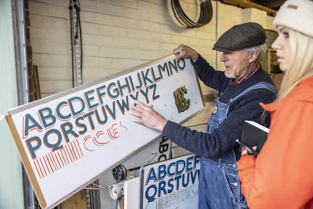
“Any signwriter worth his salt has a repertoire of typefaces in his head that can be done without needing to reference anything, but by anyone’s standards, Gill Sans is straightforward to copy because it requires a minimal amount of brush strokes. With those perfectly round O’s, it screams 1930s—it’s such a lovely type.”
Smith is adept at defusing impatience in a student. “We’ll get on to that in a minute,” he says, knowing full well that without proper practice of the basics, dropped shadows or gold leaf are going to be an uphill struggle. Slowing down and cultivating an intuition for how fonts and effects can be applied to different typefaces is all part of the signwriter’s sixth sense: “You have to know how to play with them.”
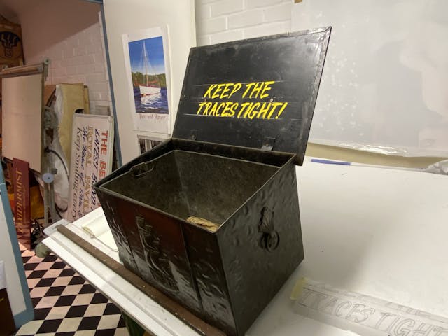
I’ve assigned myself the task of painting a slogan on a chest that belonged to my grandfather. It’s going to be a surprise for my dad. We settle on a speedy to accomplish “one stroke” style named Flash before transferring the words using the pounce method. As I grapple with a mahl stick, paintbrush, and pot, Smith says: “My one Achilles’ heel is getting A’s, V’s, and anything with a diagonal line that needs to be symmetrical not to look like a tent that’s falling over. It’s easier when they’re italic.” His favorite letter? An S: “I love the free-falling sweep of its shape.”
Occasional mistakes can be wiped away with a dab of white spirit, but Smith says that imperfections will add personality to the sign written piece. Typically it takes four hours for the enamel paint that I’ve used to dry, but our time together has come to an end.
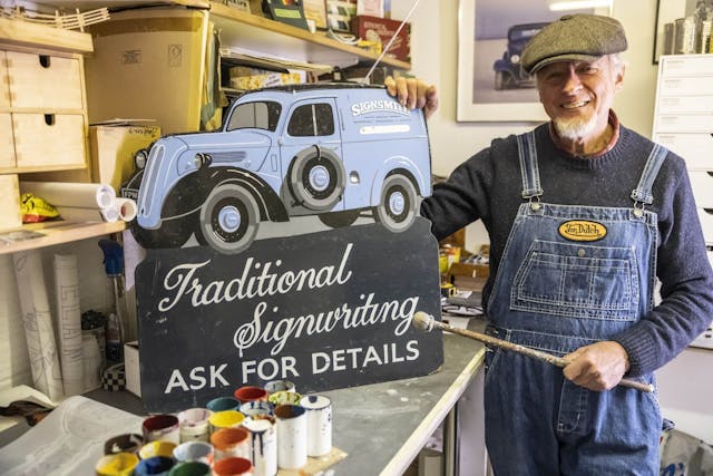
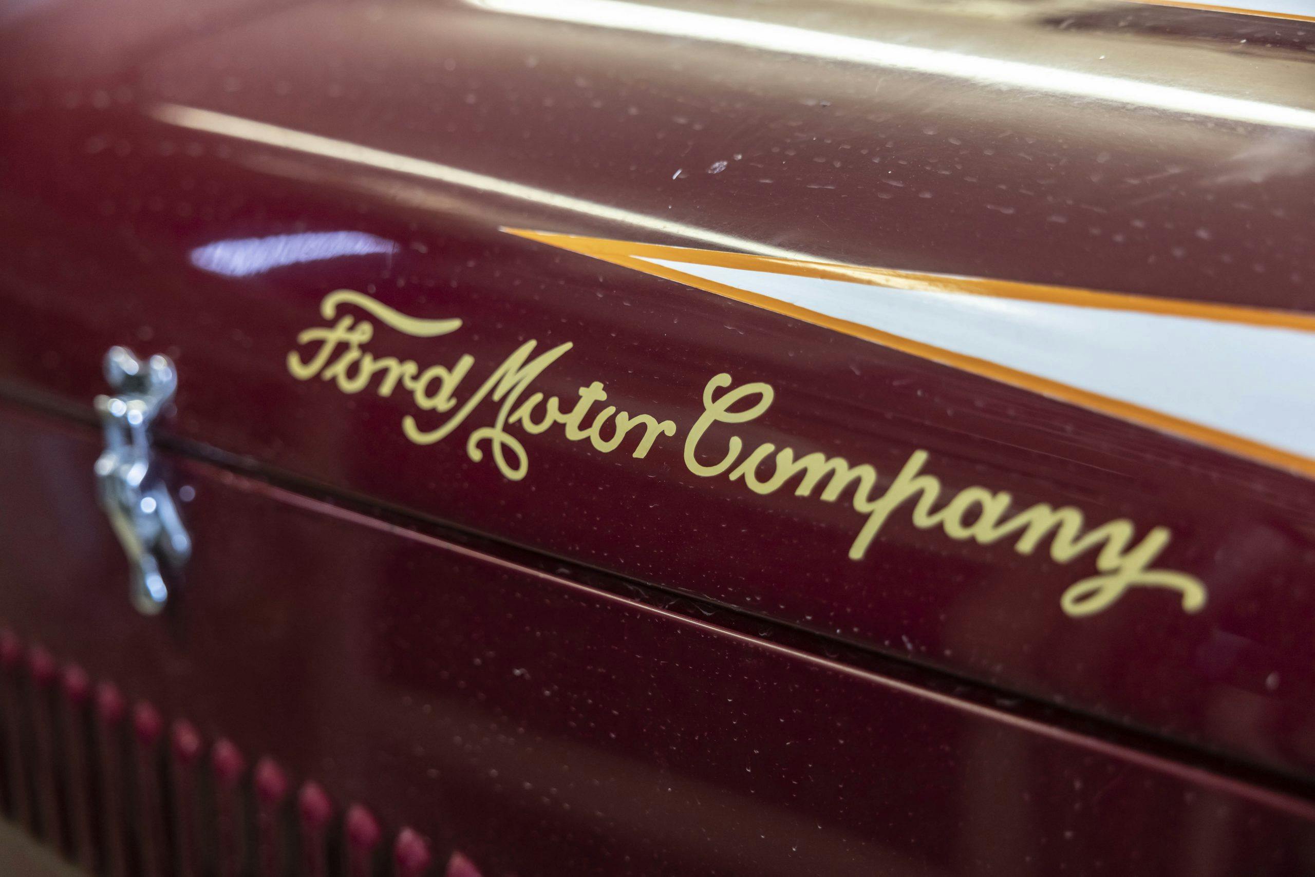
Before saying goodbye, we pause next to a Fordson van. It’s just a few shades of blue darker than Smith’s denim dungarees and the word “signsmith” is emblazoned on its side. When not parked in the courtyard that separates his living and work spaces, the van earns its keep as a mobile billboard. “It’s my trademark,” explains Smith. “Me and Ford, we’re inextricably linked—my mum and dad were employed by them, it’s how they met.”
As I drive home, away from the mist that’s rolling in from the sea, I think of Smith in his studio, now dark and turning cold, I hope that soon he will be joined by a protégé. Until then, it’s up to him to keep the craft alive.
Terry Smith: 01243 377948. Click here and here for more information about the courses Smith runs.
***
Check out the Hagerty Media homepage so you don’t miss a single story, or better yet, bookmark it. To get our best stories delivered right to your inbox, subscribe to our newsletters.
Very cool.
Great article. My sign shop was all hand lettering from 1975 to 1998.. I mainly lettered trucks. My customers complained that lettering was too hard to remove. Hence Vynal lettering. Still have part of my shop dedicated to my hand lettering.
Yep, very very cool!
I THIRD the motion!
I’m always mesmerized by signpainters and pinstripers. What an art!
And Von Dutch on the overalls.
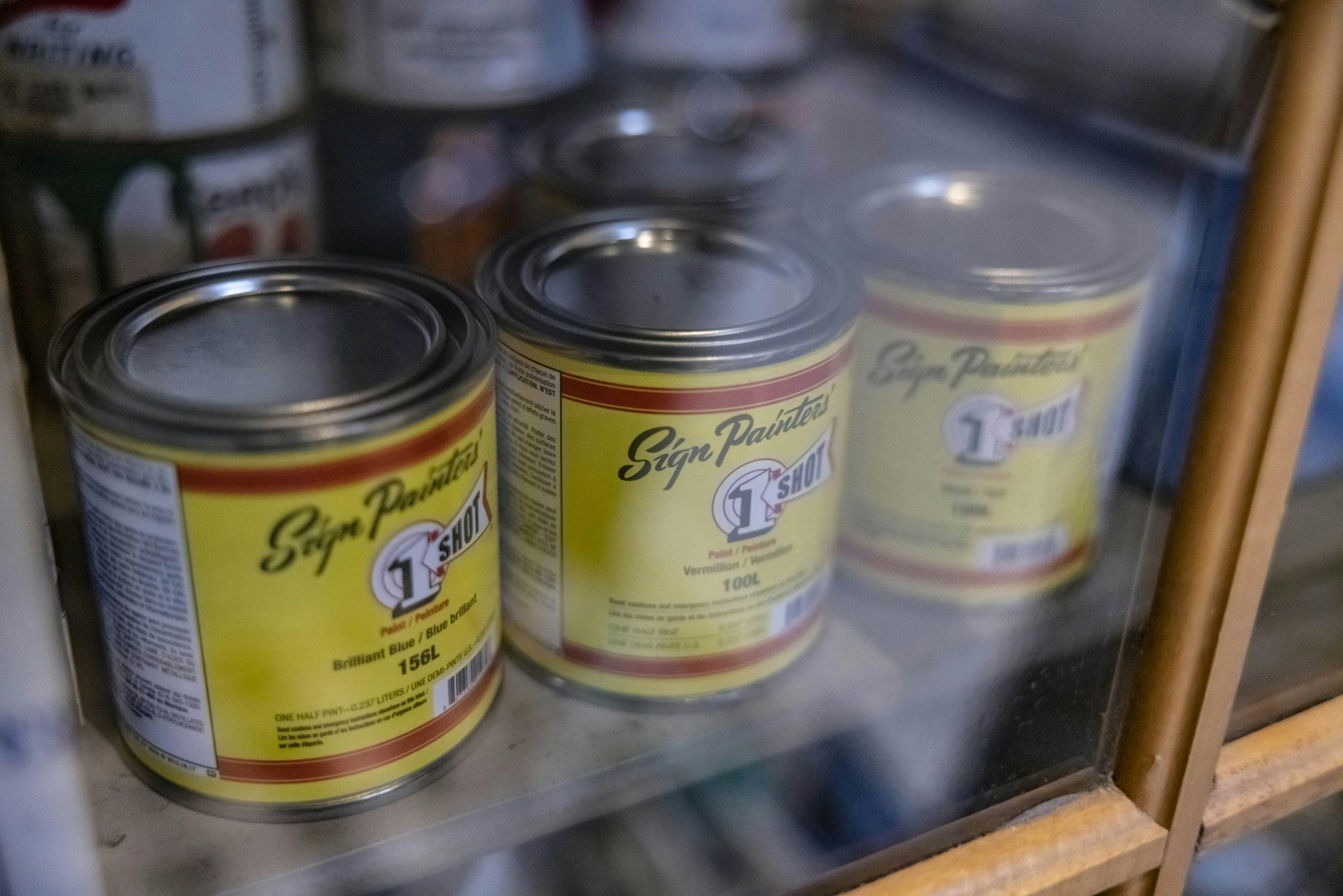
As a young guy out of high school I had the pleasure of working with a gentleman who at that time was close to retirement. Early in his career he attended an art school where he became proficient in hand lettered signage. He had a full array of the same 1 SHOT paint product in our shop that is shown in one of the pictures.
I love watching a talented person be talented. I wish he would start and Instagram account just so I can check out all the cool stuff he paints.
Loved your story and your van. I am a free lance illustrator for 50 years and by the by I drive a 1948 Anglia Thames Panel ( its a Hot ).
Nice to see an old time craftsman still hard at work. Thanks
My grandfather Richard Louis Bacon, was a sign painter in upstate New York in the early part of the century. He actually died before I was born but I have his old tool box that dates to before 1900, and some of his original tools, such as air brushes and pin striping brushes. It was fun to see this article as it brought to mind all the stories I heard from my dad about my grandfather who I never met…..
Were you lucky enough to find any examples of his art? Which “upstate”? The one you see looking north from NYC or the “real” upstate-the one you see looking east from Buffalo?
A fairly young fellow did the detail work on my freshly restored ’31 Chevy fire truck. He did it all freehand, with no tape to guide him, just chalk. The gold leaf work was incredible. With the advent of Imron paint, the old timer that applied the gold leaf at the King-Seagrave factory in Woodstock, Ontario found that the yellow paint under the gold leaf wouldn’t stick. The solution was given to him by an old Irish painter. Slice a potato in half and run the open side along the area to be painted. The acid in the potato softens the Imron just enough to get the other paint to stick.
The hardest part on mine was pinstriping the 20 inch disc wheels and getting the stripe to meet at the end !
When my dad was young in the 1930’s he would watch a sign painter do wheels. He would have the car up on jacks and he would have someone spin the wheel when he was in position with his brush. Perfect pin stripe would be done.
Great story and great comments that have me tempted to give it a go. I am retired and have plenty of time to practice.
Love the story. It’s fun to watch or learn about how talented people do their thing.
An most honorable trade and tradition. In the 1960s I had the good fortune to work for a painting company in Stratford, Ontario that employed skilled workers — some recently arrived from Germany — including amazing sign painters, truck letterers, and gold-leaf appliers. I learned a bit, but not enough to enter the field. Good luck to Mr Smith and all practitioners. May their tribe increase!
My dad’s first company was named United Excavating the logo had the word United printed in a semi-circle from 9:00 O’clock to 3:00 O’clock. The sign painter would paint the letters UNI with his right hand going upward and TED with his left hand going downward. ! He also did excellent caricatures. This was in the 60’s and I was just old enough to appreciate it! 😁
Artistry from both Terry Smith and Charlotte Vowden.
This may be the best article that I have enjoyed reading in the Newsletter. Thank you for publishing it. Really very good and brings back memories of the sign painter that did work for my Dad at his boat shop. A wonderful older black man by the name of Al Gaiden in Baton Rouge, LA. Truly an artist with a paintbrush. Great memories.