Automakers are taking “badge engineering” literally
Astrologers were in a froth last December when Jupiter and Saturn moved to their closest proximity in almost 400 years, the cosmic alignment also occurring on the exact same day (December 21) as the winter solstice. For true believers attuned to signs from the heavens, this astrological pileup was an omen for huge change, from the retiring of stale orthodoxies to the welcoming of new beginnings. Even non-believers can’t deny that the past year was, ahem, unusual.
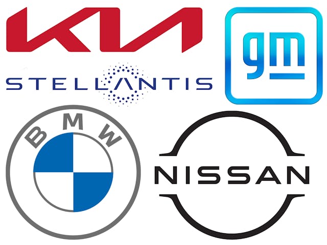
Which, perhaps, makes it no surprise that several car companies have chosen this moment to repaint their houses with fresh registered trademarks. BMW kicked it off by announcing an overhaul of its storied roundel last March, the fifth such makeover of BMW’s badge since 1917 and a huge leap from the last redesign in 1997. The black border is gone. The blue-and-white checkerboard—don’t call it a spinner, says BMW, because it represents the state colors of Bavaria and not a spinning propeller—is now surrounded by a transparent ring with “BMW” in skinny, retro lettering. Being partly see-through, the new badge will incorporate the body color of whatever vehicle it’s placed on, and represents “openness and clarity,” says Jens Thiemer, BMW’s senior vice president of customer and brand.

The new Bimmer badge also signifies a trend in the industry toward logos devoid of depth and texture. Both VW and Kia have reworked their corporate mascots by taking out any hint of three-dimensional shading, and Nissan followed suit when it unveiled its new emblem last July. What had been a stout chrome ring with chamfered edges and “Nissan” defiantly inscribed in a band in thick block letters is now reduced to just a simple set of two-dimensional half-circles with the brand name written in a slenderized font. This is because automakers increasingly see weighty grille medallions as things of the past. Instead of conveying manufacturing prowess with a mini sculpture of robustly shaped plastic, car companies want to telegraph their digital, electrified futures with multimedia-friendly insignias that translate better on screens and as LED-generated projections. Historic color palettes are giving way so that the logos can come in different hues to represent the industry’s new multipronged approaches to mobility.

Certainly that was one reason GM announced this past January a revamp of its historic blue corporate tile, which had been around in various forms since 1964. The new GM emblem, with lowercase letters and the underscore reduced to a short dash under the M, smacks of heavy dot-com influence and, according to GM, is pregnant with messaging. The lighter blue shading is an update of the old cobalt hue and represents the cleaner skies that will result from GM’s shift away from fossil fuels (though other colors will be used for different mobility ventures). The rounded corners signify inclusiveness as part of the company’s “Everybody In” campaign to promote the flexibility of its forthcoming Ultium electric-vehicle platform. And the M is vaguely reminiscent of a wall outlet. At least, a U.S.-style one. If you squint.
Well, it could be worse. There will be no American firm with the name “Chrysler” in it for the first time since Walter P. Chrysler incorporated in 1925. The merger of Fiat Chrysler Automobiles (FCA) and France’s Groupe PSA, the maker of Citroën and Peugeot among other brands, launched a new firm in January with the almost comically posh name of Stellantis. According to the company PR bumf, it derives from the Latin verb stello, meaning to “brighten with stars.” It’s only an umbrella brand that is not expected to appear on any vehicles, but the logo follows the trend of being rendered in simple, stylized 2-D, the “A” surrounded by a halo of heavenly points of light.
Befitting the moment, those mischievous change-makers, Jupiter and Saturn, are no doubt among them.