Car Design Fundamentals: Volumes and proportions
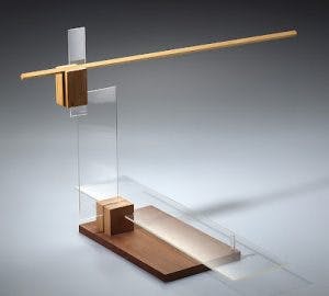
When he arrived at the world-famous Bauhaus art school in 1923—at the invitation of its founder Walter Gropius—László Moholy-Nagy was given the job of teaching (alongside the prolific artist/educator Josef Albers) the foundation course for new students. Through a series of “equilibrium exercises” Nagy encouraged his pupils to create spindly sculptures from various materials balanced on top of each other that looked fragile and unwieldy but demonstrated his central idea: When an object is in physical balance, it is in visual balance, and vice versa.
This art school theory is all well and good, but the Bauhaus didn’t teach car design. So how does it help us as we scratch our chins and pore over a clay model? It means we interpret a cars proportions and volume in terms of visual weight and how it sits on its wheels. We’ve looked at how dash-to-axle ratio, the placement of pillars, and how the driveline type can move the passenger cabin forwards or backwards in relation to the wheelbase. But that’s not the whole story.
Let’s establish some important definitions. The volume of a car is its basic shape—the outline of the body work when seen from the side. Individual elements (cabin, hood and trunk, if they are present) should complement and balance each other, without one overpowering the others. How these elements interact is what we call the proportions. Visual weight is how and where the body sits on the wheels; does the car look balanced or is it nose- or tail- heavy?
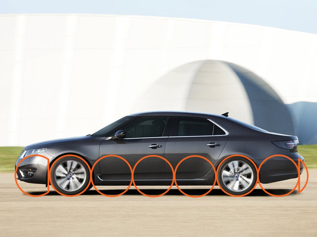
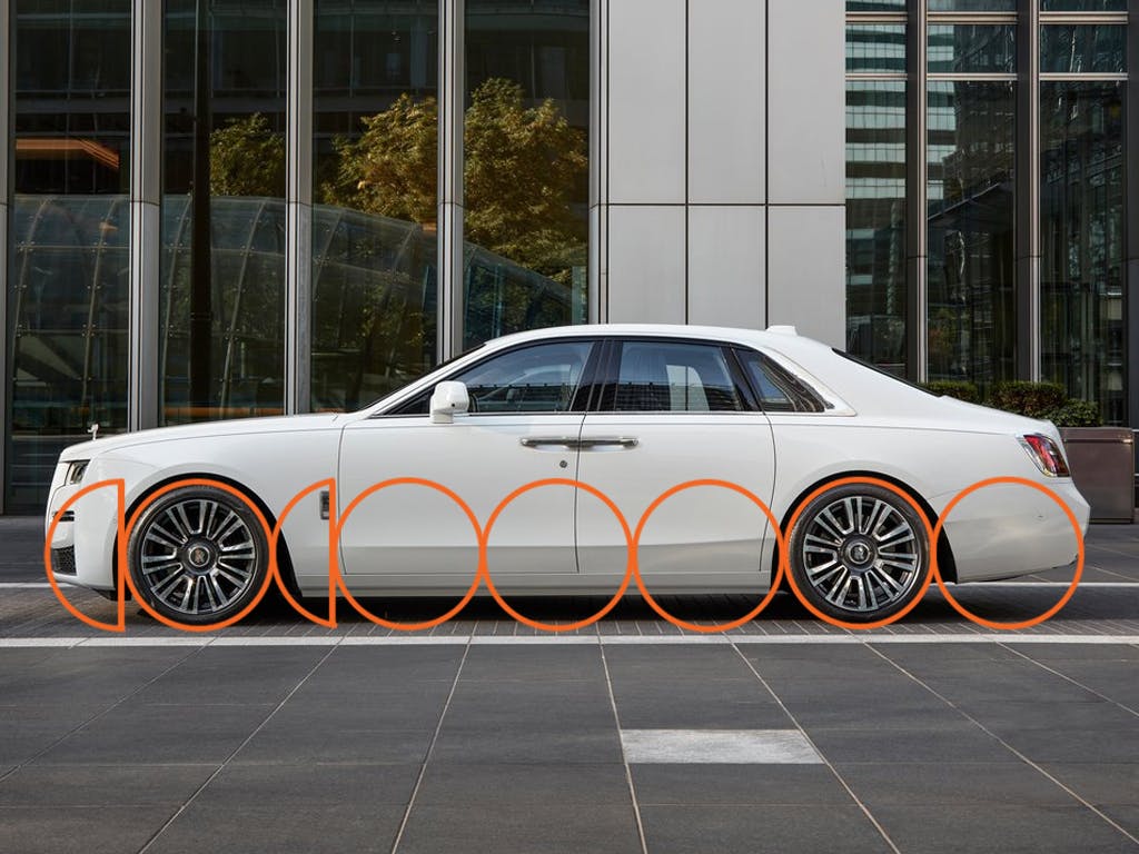
The 2010 Saab 9-5, a car I mentioned in a previous article on C-pillars, had a large rear overhang and a lot of metal behind the rear wheels, making it look tail-heavy. Compare it to the 2021 Rolls-Royce Ghost. At first glance, both cars have a similar elongated rear tapering into the trunk area. But look at the wheelbase and overhangs; the Rolls has proportionally less rear overhang and more wheelbase, so its proportions and visual weight are correct.
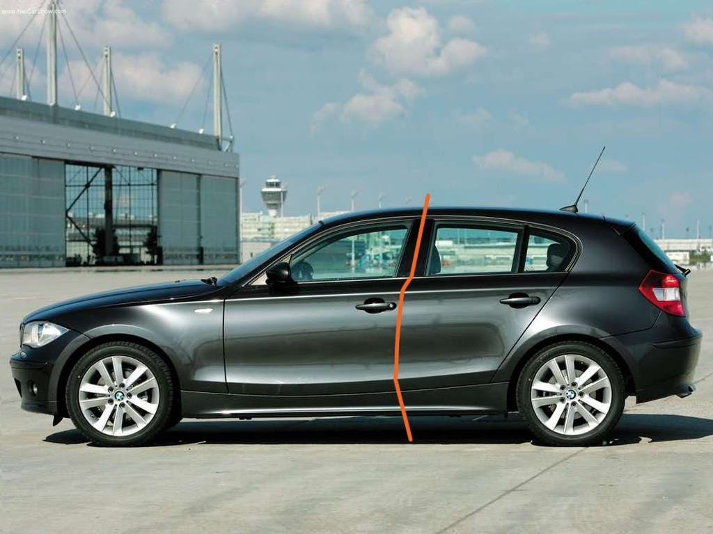
Cut the Saab in half down its B-pillar and it looks like the front and rear of two different cars. Try covering the front and then the rear of the image with your hand and you’ll see what I mean. Because the Saab is FWD, the front wheel position is fixed. But Saab should have moved the rears backwards for a more traditional FWD proportion, which would have helped. That said, this means tweaking the door openings and B-pillar—remember the “ripple effect” from my design realization article?
Putting the volumes of one driveline type on the wheelbase of another can cause visual problems. In 2008, BMW expanded down market with the 1-series and was determined to keep it rear-wheel drive. Putting a hatchback volume (traditionally FWD) on a RWD proportion resulted in an ungainly, unhappy marriage:
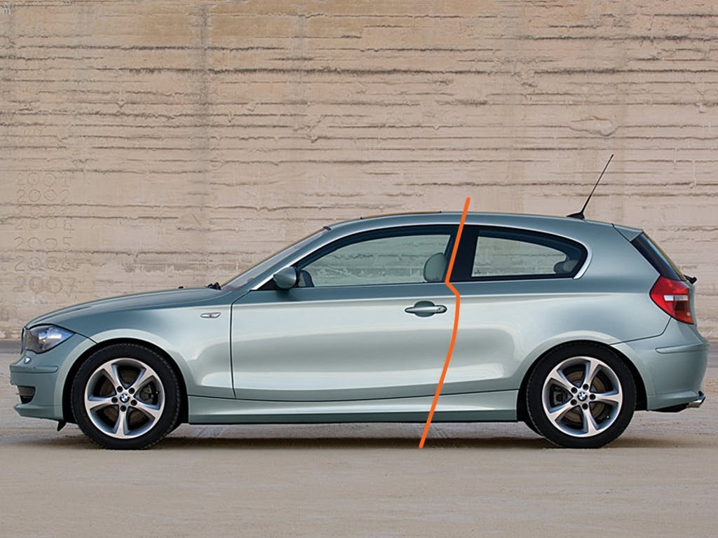
Rear of the B-pillar, the five-door 1-series hatchback looks like it’s dragging around a full diaper. The three-door version mitigates some of this because the B-pillar is further backwards, making the rear “half” of the car appear smaller. But because of the nearly vertical rake of the tailgate, neither car fully escapes looking dumpy at the back.

The 1-series Coupe, however, is much more successful, purely because it has a trunk rather than a hatch. The slimmer C-pillar and lack of extended roofline means there is much less glass and bodywork aft of the rear wheel, even though the rear overhang is fractionally longer. As enthusiasts, our brains are wired to expect a RWD to car to look a certain way, and going against this creates an awkward looking dissonance.
Slight changes in sheet metal can have a drastic effect, even on the same platform. The 2016 Mazda MX-5 Miata (ND generation) reversed the slight model bloat of the NC (it’s all relative: I had an NC for three years and had more than a few elbow-coffee mug interactions when shifting gears) into a much tighter and more aggressively designed package. It was an attempt to shed its boutique image, and the ND’s platform was originally meant to be shared with Alfa Romeo to underpin a new Alfa Spider. But once Sergio Marchionne decreed “no Alfa Romeo will ever be built in Japan,” it was passed to Fiat and resulted in the 2017 Fiat 124.
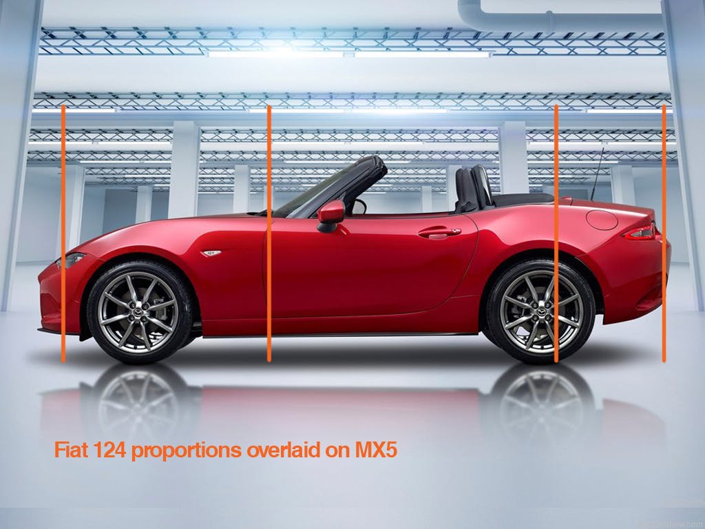
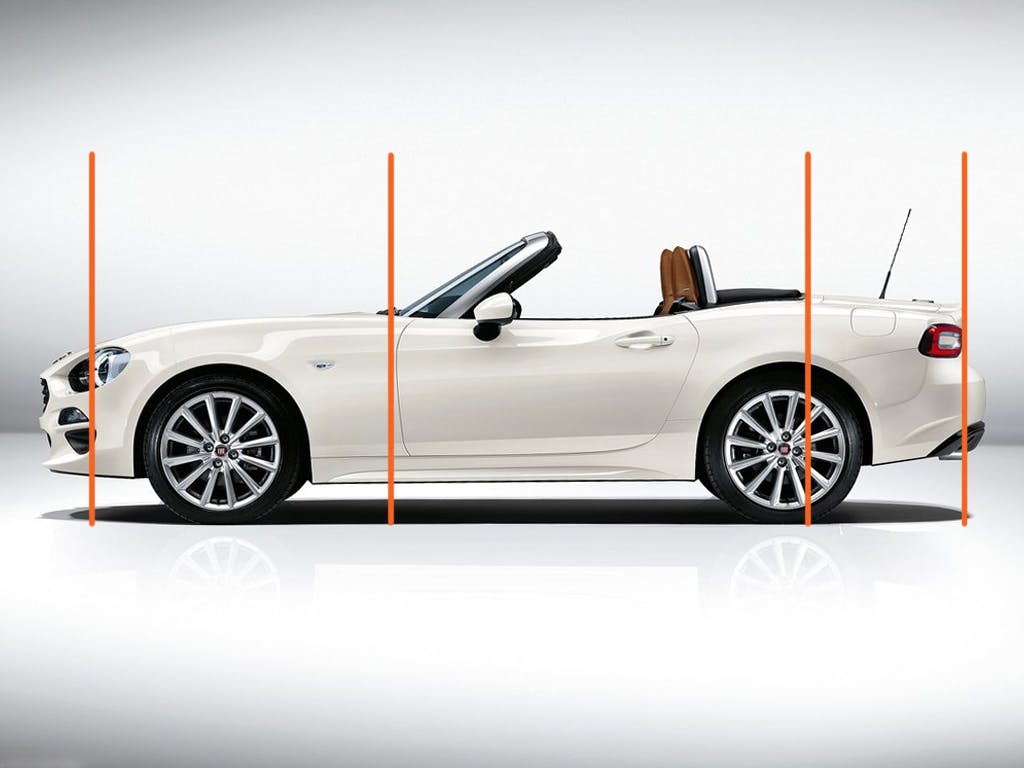
Look at how tightly the Mazda’s bodywork is sculpted ahead of the front axle line. Note the way the nose drops reduces the volume and shortens the visual length of the hood. Fiat’s 124 keeps the line of its hood higher further forward, increasing its visual length which makes the passenger cabin appear further backward, even though the 124 has a longer trunk. The result is a car that looks unbalanced and ungainly.
That said, bodywork is not the only thing we see when we “read” a car’s shape. Graphical elements and the DLO also play a part, and next time we’ll look at the way manufacturers use these to influence the way their cars look.
I’m going to have to disagree that the Fiat 124 looked unbalanced compared to the Miata. To my eye it appears more substantial and serious, a more desirable package. The Miata looks (and is) squashed.