Car Design Fundamentals: Dash to axle ratio
Now that we’ve covered how cars are designed, it’s time to review some of the terms designers use when talking about car design. Some of these words and phrases are referenced on a regular basis, even if they seem rather obscure. With that in mind, consider this your go-to reference series for car design lingo. Let’s start with one of the most common (yet most commonly misunderstood) terms: Dash to axle ratio.
Put simply, the dash to axle ratio is the distance from the base of the windshield (at its most forward point) to the middle of the front axle, measured when a car is viewed from its side profile. Of course, there’s more to the concept than just that definition. Stick with us for some design history, won’t you?
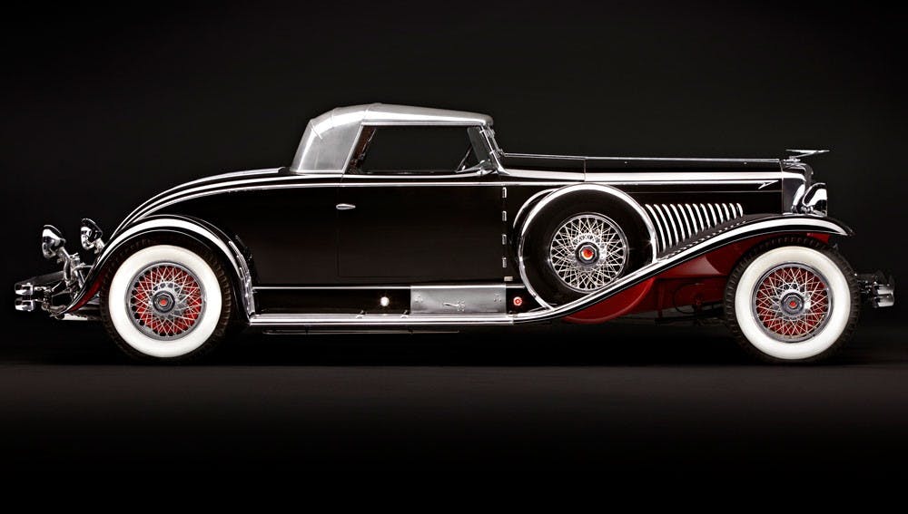
To wit, back at the turn of the last century—when motor vehicles began their transition from spindly madcap inventor style death carts to the passenger car as we understand it today—the radiator, engine and transmission were placed in a line, with the firewall (and therefore the passenger compartment) well away from the dirty, noisy, oily parts. As more expensive cars became available to meet the demands of the well-heeled, their larger engines meant a much longer distance between the front axle and the windshield. Hence, a large dash to axle ratio became an indicator that you were not clanking about in some proletarian chariot but were instead piloting something powerful, expensive, and prestigious.

As coachwork became more integrated after WWI, body-on-frame construction meant it was easy for companies to increase dash to axle (and therefore wheelbase) on their more expensive models without actually increasing the size of the passenger compartment. They merely moved the suspension a few inches farther away from the chassis’ centerline, increasing the wheelbase in the process.

So why is dash to axle so misunderstood? It’s a common misconception that for a car to look premium or sporty it requires a large dash to axle ratio. What could be more appealing than a phallic hood thrusting forwards from the passenger compartment, conveying a message of speed and power?
The problem arises when a disproportionate amount of space dedicated to this effect results in a modern vehicle that looks cartoonish and unbalanced. It’s a qualitative characteristic rather than a quantitative one. The question a designer must ask is: “Is this an appropriate amount of dash to axle for the type of car we’re designing?”
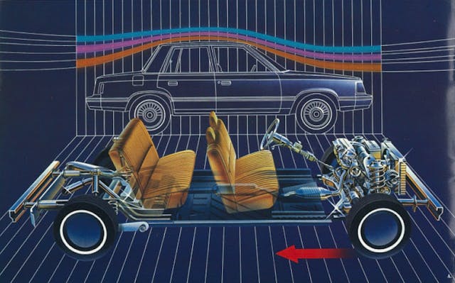
Dash to axle ratios are directly related to a vehicle’s powertrain configuration. The advantage of front-wheel drive over rear-wheel drive is that a more compact powertrain that allows for more interior space within a given wheelbase. More to the point, cars with their powertrains mounted longitudinally (RWD) generally have more dash to axle than those mounted transversely (FWD). Audi is a notable exception, as it regularly builds longitudinal engines mounted ahead of the front axle. This means that even on Audi’s larger, more prestigious cars, the front wheels are stuffed backwards, closer to the firewall with a shorter dash to axle.

Conversely, RWD cars with a large engine/gearbox that are packaged under tight body constraints have a larger dash to axle, because their tighter cabins mean the passenger compartment is squeezed rearwards. Increasing the dash to axle on a FWD vehicle isn’t a good idea because there would be no benefit, and you’d be upsetting the overall proportions. With that in mind, most modern vehicle platforms (even those with an insane degree of flexibility like Volkswagen’s MQB), the dash to axle distance is one of the few points that remains fixed. Variations can be introduced in wheelbase and track width but the engine, front suspension, firewall, pedal box, and base of the windshield relationship is something that cannot be altered.

Here’s an example of dash to axle gone wrong: The McLaren Mercedes SLR looks ridiculous with its overly long nose and hood. Look at the distance between the front wheels and the doors. It’s absolutely huge, which the distracting gills are attempting to disguise. But open the hood and you’ll see the engine is illogically tucked underneath the windshield; while mid-engine (even front-mid-engine) designs are theoretically superior in terms of dynamic performance, what was the need to shove the front wheels that far forward?


Clearly Mercedes-Benz drew the wrong lessons from the SLR (or perhaps the Zimmer Quicksilver). Look at the SLS, and the AMG GT. Benz designers really love to overdo it, don’t they?
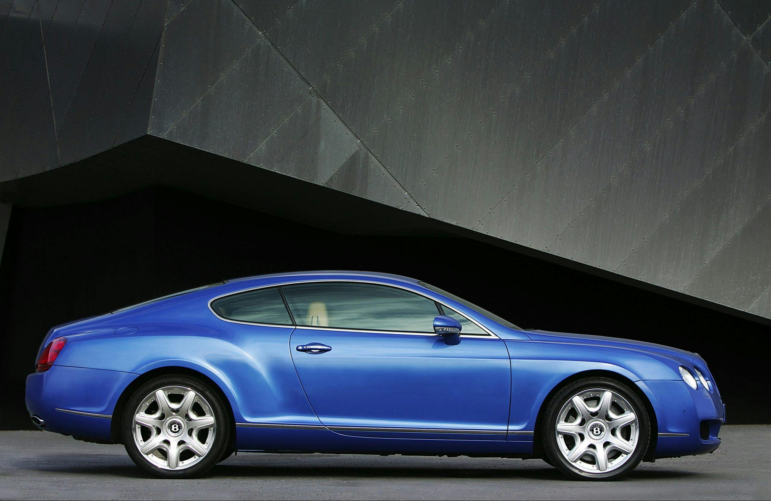
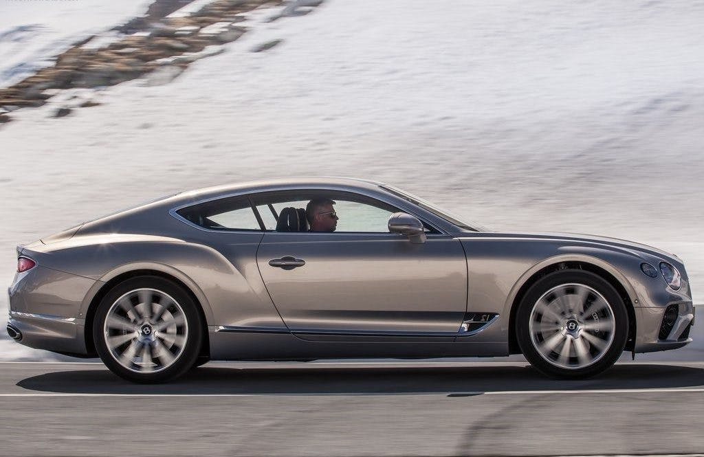
The Bentley Continental GT is an example of how to do it right, even when you have a corporate platform underpinning your design. It also proves you don’t need a huge length of dash to axle for a prestige car. Notice how on the current-generation GT (right) the wheels have moved forward slightly, a consequence of moving from a platform originally shared with the Audi A8/VW Phaeton to one shared with the Porsche Panamera.
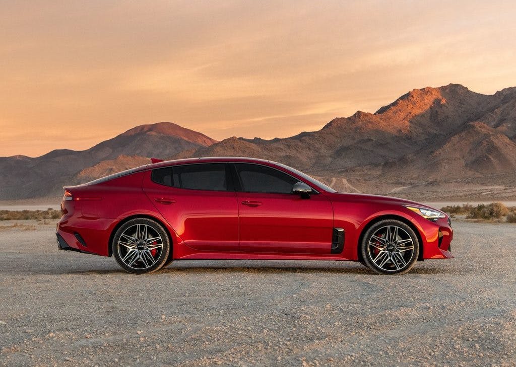
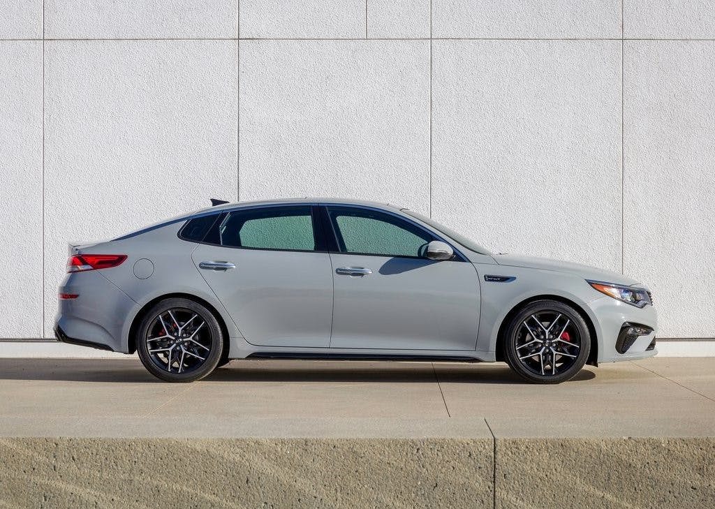
Going downmarket, behold the Kia Stinger (RWD) and the Optima (FWD). While clearly from the same brand, notice how the Stinger’s slightly longer wheelbase allows a lower roof line. There’s only a couple of inches in it, but this changes the car’s profile. The relationship between the doors and the rear wheels is similar, so therefore the extra length is in the dash to axle.
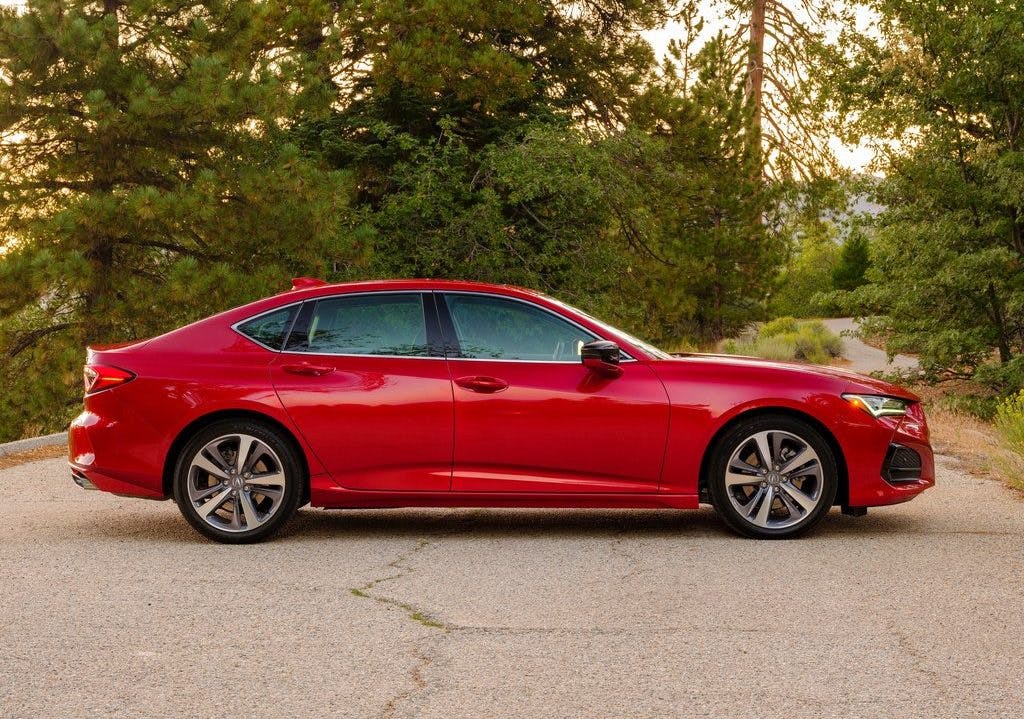

Finally, here’s a FWD car where the designers added extra dash to axle: the 2021 Acura TLX (left). Compare it to the BMW 3 Series (right), which is a legitimate RWD sport sedan. Because the Acura’s wheels (and hence the powertrain) are pushed further forward, the TLX has a bulbous front overhang, giving it the worst of both worlds.
Like everything with car design, subtlety is the order of the day. There’s no need to make huge changes to have a drastic effect on the overall shape.
A secondary, critical part of dash to axle is the relationship between the A-pillar and the front wheels. We’ll have a look at that bit of car design in our next installment.

Re. The SLR, I’m very circumspect about anyone who’s suggesting they know better than Gordon Murray when it comes to something like engine placement.
There’s quite a bit to dislike about the SLR’s rather glitzy design but like the Bentley Continental its form is a victim of its engineering. However, one form speaks of an engineering compromise and the other speaks of an unwillingness to compromise.